


Seleccione este tipo de licencia cuando esté desarrollando una aplicación app para iOS, Android o Windows Phone, y vaya a incrustar el archivo en el código de su aplicación móvil. va a incrustar el archivo fuente en el código de su aplicación móvil.
Bream
por Hackberry Font Foundry
Estilos individuales desde $24.95 USD
Familia completa de 2 fuentes: $32.95 USD


Bream Fuente La familia era
diseñada por
David Bergsland y
publicado por
Hackberry Font Foundry. Bream contiene
2
estilos y opciones de paquetes familiares.
Más información sobre esta familia
- Aa Glifos
-
¡Mejor PrecioPaquetes de familia
- Estilos individuales
- Especificaciones técnicas
- Licencias
Por Estilo:
$16.47 USD
Paquete de 2 estilos:
$32.95 USD
Sobre la familia Bream Fuente
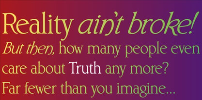
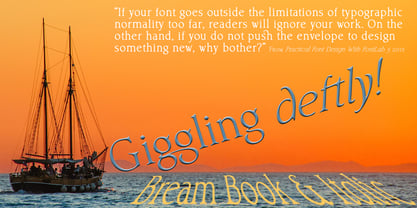
This is the display version of Librum. Librum means “book” in Latin, which I thought was appropriate. Bream is Latin for proclaim—appropriate for display work. The fonts are very close to Librum-Book and Librum-Italic, with the same OpenType features. The glyphs are modified a bit to make them a little more elegant, but that’s not very noticeable. Mainly, the letterspacing and kerning is tighter and more carefully fit to large point sizes. As for classification, I like oldstyle, Venetian, geralde, English oldstyle. There’s discrete modulation, slanted crossbars, full brackets serifs of medium thickness and sharp cut ends. For a great deal, see Librum Book Design Group, for a package containing all fifteen fonts!
Diseñadores: David Bergsland
Editorial: Hackberry Font Foundry
Fundición: Hackberry Font Foundry
Propietario del diseño: Hackberry Font Foundry
MyFonts debut: Jan 19, 2016
Bream

Acerca de Hackberry Font Foundry
- The Hackberry Font Foundry was founded in the 1998 to sell the fonts David Bergsland designed to be used in his digital publishing training books.
- The goal of David’s fonts is to add a hand-drawn edge to them. In this age of increasing technological “slickness” he purposely loosens the structure and adds “air” to the glyphs with breaks.
- All fonts are designed as OpenType Pro fonts with special production features. Almost all of the fonts have oldstyle numbers as well as small cap figures, plus small caps, discretionary ligatures & special dingbats.
- They really shine in book production.
- The production families have contrasting serif and sans serif families both using the same vertical font metrics—for run-in heads and the like.
- At present he mainly writes and designs books.
Seguir leyendo
Leer menos
- Al seleccionar una opción, se actualiza toda la página.