


Seleccione este tipo de licencia cuando esté desarrollando una aplicación app para iOS, Android o Windows Phone, y vaya a incrustar el archivo en el código de su aplicación móvil. va a incrustar el archivo fuente en el código de su aplicación móvil.
CA Saygon Text
por Cape Arcona Type Foundry
Estilos individuales desde $40.00 USD
Familia completa de 14 fuentes: $200.00 USD

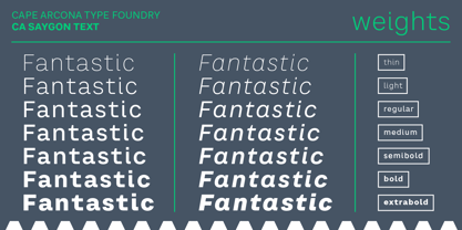
CA Saygon Text Fuente La familia era
diseñada por
Stefan Claudius y
publicado por
Cape Arcona Type Foundry. CA Saygon Text contiene
14
estilos y opciones de paquetes familiares.
Más información sobre esta familia
- Aa Glifos
-
¡Mejor PrecioPaquetes de familia
- Estilos individuales
- Especificaciones técnicas
- Licencias
Basic typesetting
Letter case
Numerals and scientific typesetting
Typographic variants
Restablecer
CA Saygon Text Basic Pack
8 fuentesPor Estilo:
$17.50 USD
Paquete de 8 estilos:
$140.00 USD
Sobre la familia CA Saygon Text Fuente
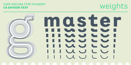
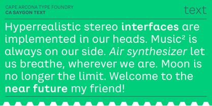
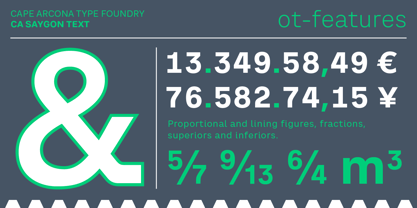
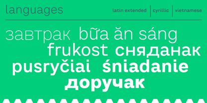
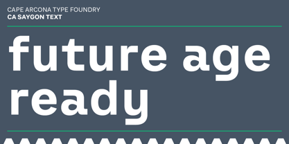
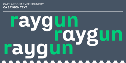
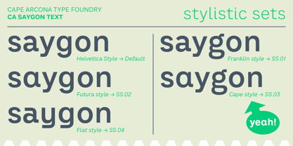
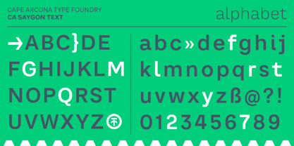
CA Saygon Text is the logic consequence of CA Saygon. It is much calmer and therefore also suitable for reading texts and everyday’s editorial tasks. Basic shapes and proportions were adopted from Saygon and continued in such a way that a font family from Thin to Extrabold resulted. A fundamental inspiration were early static grotesque typefaces such as Akzidenz Grotesk. Nevertheless, the typeface was by no means intended to have a historical look. Thus, a relatively high x-height was chosen, which makes the typeface quite economical in type-setting, since the letters appear visually larger. A relatively small line spacing with good legibility can be achieved due to the small ascenders and the low cap height. Letters like f and t, which otherwise tend to end in curves, were given right angles, which on the one hand meets certain design elements of the original Saygon, but on the other hand also refers to contemporary trends in typeface design. A special feature are the five styles in which CA Saygon Text can be used. The default setting is the Helvetica style, with two-storey a and g. The Futura style has a single-storey a and a two-storey g accordingly. The third style with two-storey a and three-storey g is called the Franklin style. But the real highlight is the Cape style with single-storey a and three-storey g – a real rarity up to now. Let yourself be inspired by this unusual typeface. If you like it even more progressive, you should try the flat style, which continues the right angles in a, g, and y as well. Thanks to the Cyrillic and Latin Extended character sets, a huge linguistic area is covered that even extends to Vietnam! Even the exotic German capital-double-s is available and appears automatically when typed between other capital letters. Numerous OpenType features make life easier for the professional typographer: there are fractions, superscript and subscript numbers, as well as proportional and tabular capitals.
Diseñadores: Stefan Claudius
Editorial: Cape Arcona Type Foundry
Fundición: Cape Arcona Type Foundry
Fundición original: Cape Arcona Type Foundry
Propietario del diseño: Cape Arcona Type Foundry
MyFonts debut: Apr 18, 2019
CA Saygon Text
Acerca de Cape Arcona Type Foundry
The Cape Arcona Type Foundry is a type studio based in Essen/Germany run by Stefan Claudius and Thomas Schostok, established in 2002. In our work, we are aiming for typefaces with a non-conformist personality. Over the years, the field of business expanded from individual typeface design to custom font production, corporate and logo design and complex text-font families. This is the kind of work we love: Thinking beyond the ordinary, imagining better worlds and better fonts.
Seguir leyendo
Leer menos
