


Seleccione este tipo de licencia cuando esté desarrollando una aplicación app para iOS, Android o Windows Phone, y vaya a incrustar el archivo en el código de su aplicación móvil. va a incrustar el archivo fuente en el código de su aplicación móvil.
Corsa Grotesk
por Typedepot
Estilos individuales desde $39.00 USD
Familia completa de 20 fuentes: $199.00 USD

Corsa Grotesk Fuente La familia era
diseñada por
Alexander Nedelev y
publicado por
Typedepot. Corsa Grotesk contiene
20
estilos y opciones de paquetes familiares.
Más información sobre esta familia
- Aa Glifos
-
¡Mejor PrecioPaquetes de familia
- Estilos individuales
- Especificaciones técnicas
- Licencias
Corsa Romans
10 fuentesPor Estilo:
$9.90 USD
Paquete de 10 estilos:
$99.00 USD
Corsa Essentials
4 fuentesPor Estilo:
$24.75 USD
Paquete de 4 estilos:
$99.00 USD
Sobre la familia Corsa Grotesk Fuente
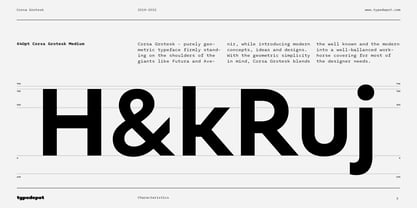
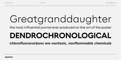
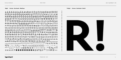
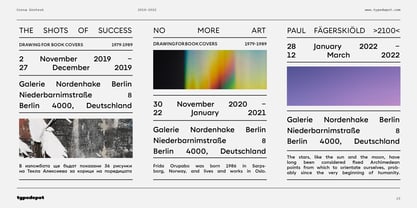
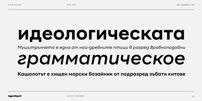
Corsa Grotesk is our very own tribute to two typographic giants: the Futura and Avenir typefaces. It is Designed with geometric simplicity in mind with well balanced strokes and modern touch. Generous proportions and x-height with more contemporary details - the single story ‘a’ and the horizontally barred ‘k’ being just two of many examples makes it shine in every jobs it takes.
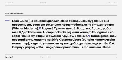
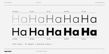
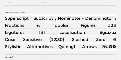
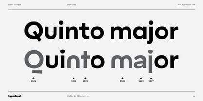
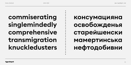
Corsa Grotesk blends the classic geometric aesthetics into a well-balanced font with generous proportions and minimal contrast. It features 10 weights ranging from Hairline to Black plus matching italics, as well as Cyrillic support for Bulgarian and Russian localizations. Filled with all the essential OpenType features like tabular figures, fractions, ligatures etc, it is a great choice for branding, advertising, user interfaces or any text that needs a bit of polish and a slick, present-day look that still feels familiar.
With its 2.0 version we managed to polish the font even more. We revisited every path and fixed all the inaccuracies throughout. Corsa Grotesk now comes with way better and consistent spacing and kerning, just the right amount of contrast and balance.
Diseñadores: Alexander Nedelev
Editorial: Typedepot
Fundición: Typedepot
Propietario del diseño: Typedepot
MyFonts debut: Apr 3, 2019
Corsa Grotesk
Acerca de Typedepot
Typedepot co-founders Alexander Nedelev and Veronika Slavova say, “In the beginning, Typedepot was a side project, nothing serious – just experimenting with letterforms. Then, in a moment it just felt more right to do this than anything else.” Based in Sofia, Bulgaria, the duo first came upon type design while working as graphic designers in advertising. “We had absolutely no background in type design,” Alexander says, “but we had this project, a logotype for a small company, which we developed to become the Glide typeface.” Two years later they rented an office, took the plunge and started designing type full time. “Now it’s the thing we do and the thing we love to do.” So far they’ve seen great success with Best Seller Centrale Sans. The modern sans serif typeface was featured as one of MyFonts Most Popular Fonts of 2011 and was featured in our Rising Stars Newsletter that same year. The self-taught designers whose foundry started out as a way to experiment with type, say that their main focus is “to design original typefaces for retail and custom use.”
Seguir leyendo
Leer menos
- Al seleccionar una opción, se actualiza toda la página.