Seleccione este tipo de licencia cuando esté desarrollando una aplicación app para iOS, Android o Windows Phone, y vaya a incrustar el archivo en el código de su aplicación móvil. va a incrustar el archivo fuente en el código de su aplicación móvil.
Croteau
por Typodermic

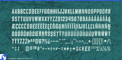
Sobre la familia Croteau Fuente
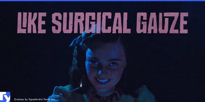
Step into the shadows with Croteau, a typeface that doesn’t just flirt with darkness—it embraces it with open arms. Born from the nightmarish visions of 1960s horror cinema, Croteau isn’t just a font; it’s an experience that will send shivers down the spine of your audience and breathe ghastly life into your designs.
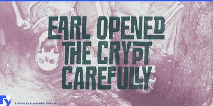
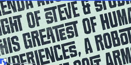
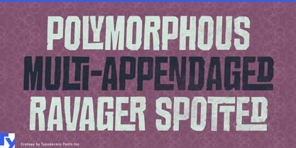
Croteau doesn’t merely communicate—it haunts. With its 250 bespoke ligatures, this typeface conjures an interlocking letter effect that’s as mesmerizing as it is unsettling. Each character seems to writhe and twist, creating a tapestry of terror that breaks the monotony of standard type and replaces it with an eerie dance of letters. This is typography that doesn’t just sit on the page—it lurks, ready to leap out at unsuspecting readers.
In OpenType-savvy applications, Croteau truly comes alive. The interplay of its standard ligatures creates an atmosphere of unease that permeates every word. But beware: turning off this feature might break the spell. Keep the "standard ligatures" activated to ensure your message retains its full, horrifying potential. Croteau’s ability to terrify transcends language barriers. Supporting over 100 Latin-based European writing systems, it spreads its eerie influence across borders. Whether you’re crafting a bone-chilling novel in Norwegian or designing a haunted house poster in Polish, Croteau ensures your message remains as terrifying in Zulu as it is in Afrikaans.
Imagine the possibilities: film posters that seem to bleed fear, book covers that readers hesitate to touch, or event invitations that promise a night of delightful fright. Croteau isn’t just a typeface—it’s a portal to a world where every letter holds the potential for horror. But Croteau isn’t just about fear—it’s about artistry. Its design pays homage to the golden age of horror, capturing the essence of a time when shadows loomed larger and every creak of a floorboard held potential for terror. It’s a tool for designers who understand that true horror lies not in what’s shown, but in what’s suggested.
So, are you ready to give your audience goosebumps? To create designs that linger in the mind long after the lights go out? Embrace the darkness with Croteau.
Diseñadores: Ray Larabie
Editorial: Typodermic
Fundición: Typodermic
Propietario del diseño: Typodermic
MyFonts debut: Nov 29, 2005

Acerca de Typodermic
Welcome to Typodermic Fonts, a spirited type foundry rooted in Nagoya, Japan, started by the Canadian typeface designer, Raymond Larabie in 2001. Our library brims with 500+ diverse typefaces to fuel creativity in graphic design, advertising, web, and app development. As digital type pioneers, we adopted web fonts and app licensing early, consistently pushing the design envelope. With Canadian heart and Japanese precision, we're your global partners in extraordinary typography. Explore Typodermic Fonts—where creativity meets character.
Seguir leyendo
Leer menos
- Al seleccionar una opción, se actualiza toda la página.


