


Seleccione este tipo de licencia cuando esté desarrollando una aplicación app para iOS, Android o Windows Phone, y vaya a incrustar el archivo en el código de su aplicación móvil. va a incrustar el archivo fuente en el código de su aplicación móvil.
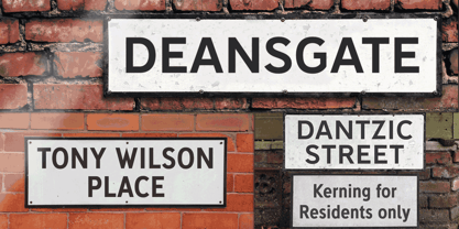
Deansgate
por K-Type
Estilos individuales desde $20.00 USD
Familia completa de 12 fuentes: $40.00 USD
Deansgate Fuente La familia era
diseñada por
Keith Bates y
publicado por
K-Type. Deansgate contiene
12
estilos y opciones de paquetes familiares.
Más información sobre esta familia
- Aa Glifos
-
¡Mejor PrecioPaquetes de familia
- Estilos individuales
- Especificaciones técnicas
- Licencias
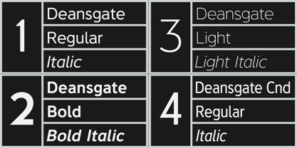
Deansgate family (normal width)
6 fuentesPor Estilo:
$3.33 USD
Paquete de 6 estilos:
$20.00 USD
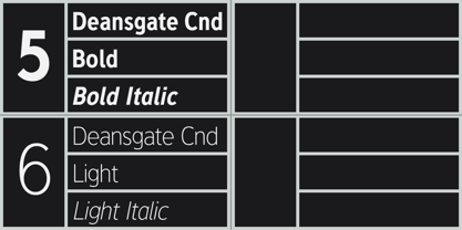
Deansgate Condensed family
6 fuentesPor Estilo:
$3.33 USD
Paquete de 6 estilos:
$20.00 USD
Sobre la familia Deansgate Fuente
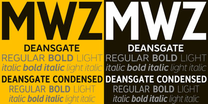
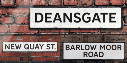
DEANSGATE and DEANSGATE CONDENSED are two packages based on the clearest and most distinctive of the sans-serif letterforms used on Manchester street nameplates, and easily identified by a pointy Z and pointed vertex/apex on M and W. The Bold weights of each family are perfect for signage, with almost monoweight strokes designed for easy reading, close up or at distance, and with the legible, slightly ’squarified’ round shapes normally associated with grotesque faces. The new lowercase tips the hat to the Transport fonts, and the Regular and Light weights transfer the clarity of the Bold faces to Deansgate’s text fonts which are ideal for use on the web or in print. Each weight has a complementary Italic..
Diseñadores: Keith Bates
Editorial: K-Type
Fundición: K-Type
Propietario del diseño: K-Type
MyFonts debut: Oct 13, 2015
Deansgate

Acerca de K-Type
K-Type is a small, independent type foundry based in Manchester England, offering a unique range of high quality fonts which are modestly and simply priced for designers, small businesses and large organisations.In addition to creating new typefaces resulting from formal experimentation, many K-Type fonts show the influence of inspirational artists and designers, many exploring the mix of insular and eclectic that has forged the typographical landscape of Britain and America.K-Type is also keen to make affordable fonts from styles which possess cultural currency or an existing social presence, generally redrawn to include comprehensive character sets containing a full complement of Latin Extended-A glyphs. New, previously unavailable weights and italics are often designed and added.
Seguir leyendo
Leer menos
- Al seleccionar una opción, se actualiza toda la página.