


Seleccione este tipo de licencia cuando esté desarrollando una aplicación app para iOS, Android o Windows Phone, y vaya a incrustar el archivo en el código de su aplicación móvil. va a incrustar el archivo fuente en el código de su aplicación móvil.
DF Dejavu Pro™
por Dutchfonts
Estilos individuales desde $39.00 USD
Familia completa de 10 fuentes: $330.00 USD

DF Dejavu Pro Fuente La familia era
diseñada por
Ko Sliggers y
publicado por
Dutchfonts. DF Dejavu Pro contiene
10
estilos y opciones de paquetes familiares.
Más información sobre esta familia
- Aa Glifos
-
¡Mejor PrecioPaquetes de familia
- Estilos individuales
- Especificaciones técnicas
- Licencias
Por Estilo:
$33.00 USD
Paquete de 10 estilos:
$330.00 USD
Sobre la familia DF Dejavu Pro Fuente
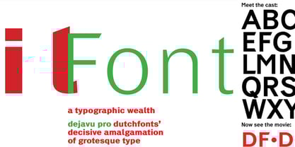
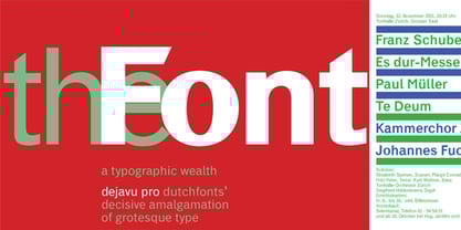
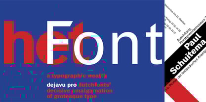
This font is an orphanage where all the beautiful details of classical grotesque typefaces from the early twentieth century are gathered, and thus living together, are forming a ‘new’, happy family. The aim was to collect my favorite characters in one font. The start was an eclectic collection orientated on British types from the Caslon Doric No. 4, the Monotype Grotesque, the Gill, the Franklin Gothic up to the Transport. In this amalgamation I avoided the narrow apertures in the ‘e’, ‘c’ and in the numerals ‘5’, ‘6’ and ‘9’ and enlarged the x-height dramatically. To the classical slanted form of the italics I added real italic forms for ‘a’, ‘e’ and ‘g’ in order to obtain a more distinguished italic style.
DF-Dejavu Pro supports all Latin-based languages (Western, Central-European, Eastern-European, Baltic and Turkish) and includes small capitals, ligatures, inferior & superior numerals and letters, fractions, various numeral styles: proportional lining, tabular lining, proportional old-style, tabular old-style and last but not least a slashed zero.
Diseñadores: Ko Sliggers
Editorial: Dutchfonts
Fundición: Dutchfonts
Fundición original: Dutchfonts
Propietario del diseño: Dutchfonts
MyFonts debut: Nov 10, 2010
DF Dejavu Pro™
is a trademark of Ko Sliggers and Dutchfonts.
Acerca de Dutchfonts
DutchFonts is a type foundry set up by Ko Sliggers to develop and sell his typedesigns. Since 1979 typography has been a vital ingredient in his graphic design. Altering a character from an existing typeface never was a problem if the desired form asked for it. Painted and drawn letterforms gave his work an unmistakable typographic identity. From 1997 his designs were made with self-designed typefaces. In the various typefaces he developed, he tried to bring back irregularity as an articulation of a personal “hand-made”, human approach and expression. The fonts are partially based on, and inspired by found, vernacular letterforms. After he set up his studio in the northeastern part of Holland in 2002 on top of the old mound Lalleweer he started marketing fonts by www.lalleweer.nl and recently through www.dutchfonts.com. “Dutchfonts is typically Dutch in the sense that it combines precision and rationality with dada-like anarchism and irreverence.” (Jan Middendorp in 'Dutch Type')
Seguir leyendo
Leer menos
- Al seleccionar una opción, se actualiza toda la página.