


Seleccione este tipo de licencia cuando esté desarrollando una aplicación app para iOS, Android o Windows Phone, y vaya a incrustar el archivo en el código de su aplicación móvil. va a incrustar el archivo fuente en el código de su aplicación móvil.
Distinction
por Great Lakes Lettering
Estilos individuales desde $12.00 USD

Distinction Fuente La familia era
diseñada por
Dathan Boardman y
publicado por
Great Lakes Lettering. Distinction contiene
1
estilos.
Más información sobre esta familia
Sobre la familia Distinction Fuente
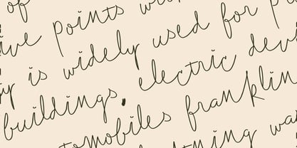
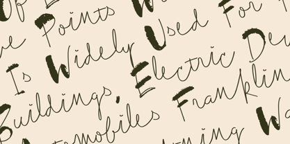
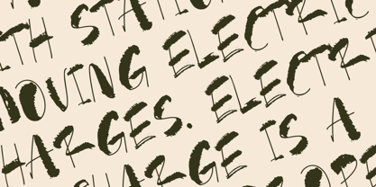
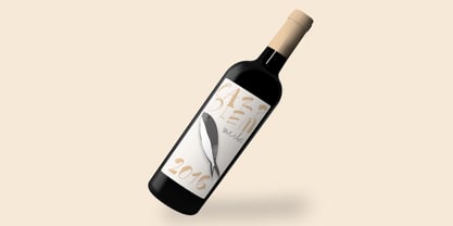
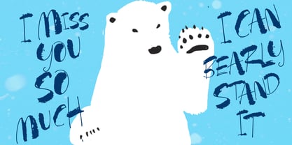
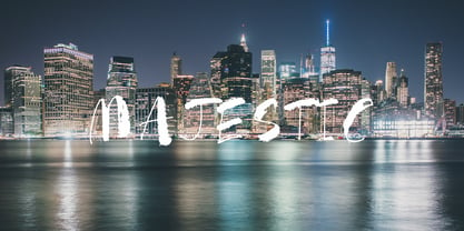
Distinction Is a brand new font from Great Lakes Lettering. A high contrast brush script with a ton of usefulness. Make you mark with Distinction.
Diseñadores: Dathan Boardman
Editorial: Great Lakes Lettering
Fundición: Great Lakes Lettering
Fundición original: Great Lakes Lettering
Propietario del diseño: Great Lakes Lettering
MyFonts debut: Jan 11, 2020
Distinction
Acerca de Great Lakes Lettering
Dathan Boardman and Molly Jacques Erickson founded Great Lakes Lettering with a mutual appreciation for artful calligraphy. “In 2012 I had been working on lots of calligraphic fonts and came across Molly’s work and was immediately struck by how visceral it was and how it didn’t really look like any other kind of calligraphy that I’ve come across,” Dathan says. “I reached out to her wondering if she had any interest in turning her lettering into fonts.” The duo’s first typeface, Frosted, was released later that year. Dathan and Molly’s bestselling typefaces include Asterism, a calligraphy style font with a moving baseline and lots of shining personality, and Kailey, a hand lettered typeface that was inspired by Molly’s signature lettering style, consisting of bold brush strokes, fluid flourishes, and distinctive characters. Alissa Mazzenga joined the team in 2014 with the the foundry’s debut of her design, Feast; a typeface whose magic seems to reside in the ethereal movement of fluid wisps of ink, forming soft arched lines and design that stands alone. The group’s fonts are best known for working in a variety of settings, both formal and informal. They’ve worked with brands such as Nike and Martha Stewart and have a lot more ahead of them. “We have a lot of exciting collaborations ahead. As our fonts are becoming more refined and more formal, we are reaching a new level of elegance that makes us excited to keep going and keep perfecting our working method.
Seguir leyendo
Leer menos
- Al seleccionar una opción, se actualiza toda la página.