


Seleccione este tipo de licencia cuando esté desarrollando una aplicación app para iOS, Android o Windows Phone, y vaya a incrustar el archivo en el código de su aplicación móvil. va a incrustar el archivo fuente en el código de su aplicación móvil.
Epoca Pro
por Hoftype
Estilos individuales desde $39.00 USD
Familia completa de 8 fuentes: $199.00 USD


Epoca Pro Fuente La familia era
diseñada por
Dieter Hofrichter y
publicado por
Hoftype. Epoca Pro contiene
8
estilos y opciones de paquetes familiares.
Más información sobre esta familia
- Aa Glifos
-
¡Mejor PrecioPaquetes de familia
- Estilos individuales
- Especificaciones técnicas
- Licencias
Por Estilo:
$24.87 USD
Paquete de 8 estilos:
$199.00 USD
Sobre la familia Epoca Pro Fuente
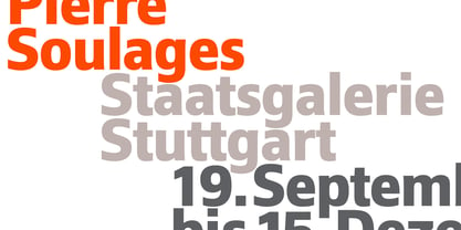
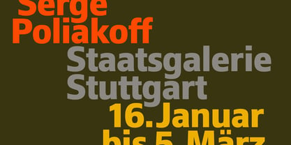
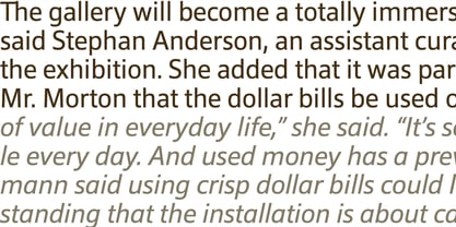
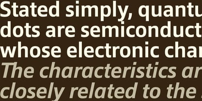
Epoca, designed in 2010, is a classic linear sans for text and display.
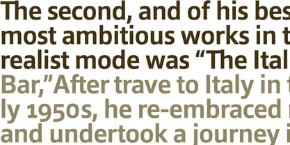
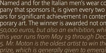
It has economical proportions, a neutral appearance and a discreet elegance. While sturdy and robust, it is nonetheless a strong workhorse. The slightly angular shape of the round elements results in a quiet flow of the line which enables fatigue-proof reading even with large amounts of text.
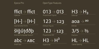
Epoca comes in eight styles and in OpenType format. All weights contain small caps, standard ligatures, proportional lining figures, tabular lining figures, proportional old style figures, lining old style figures, matching currency symbols, fraction- and scientific numerals.
Diseñadores: Dieter Hofrichter
Editorial: Hoftype
Fundición: Hoftype
Propietario del diseño: Hoftype
MyFonts debut: May 16, 2011
Epoca Pro
Acerca de Hoftype
German designer Dieter Hofrichter started his foundry in 2010. Since then, he has remained focused on developing text fonts that integrate the rich history and tradition of typography with contemporary styles. Based in Munich, his first typeface on MyFonts was Impara, a sans serif with lively stroke ductus and distinct humanistic characteristics that is a representation of linear coolness and classic elegance. Since his debut, he has continued to produce beautiful, high quality serif faces. Capita, one of the foundry’s best sellers, is a self-dominated face with a fresh style that avoids the harshness of many slab serifs. Dieter has also seen success with one of his most recent designs, Mangan, a text face that combines classical rationality with contemporary design. “One of our intentions is to utilize the knowledge of the history of type to create contemporary types,” Dieter says. “Style consciousness and many years of experience in type design are our qualifications for producing functional and usable types of high quality.”
Seguir leyendo
Leer menos
- Al seleccionar una opción, se actualiza toda la página.