


Seleccione este tipo de licencia cuando esté desarrollando una aplicación app para iOS, Android o Windows Phone, y vaya a incrustar el archivo en el código de su aplicación móvil. va a incrustar el archivo fuente en el código de su aplicación móvil.
Gord
por Typodermic
Estilos individuales desde $69.95 USD
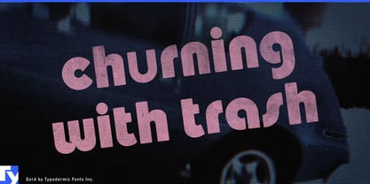
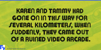

Gord Fuente La familia era
diseñada por
Ray Larabie y
publicado por
Typodermic. Gord contiene
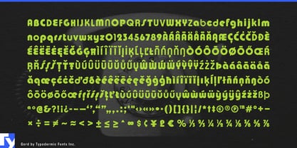
1
estilos.
Más información sobre esta familia
Basic typesetting
Letter case
Numerals and scientific typesetting
Typographic variants
Restablecer
Sobre la familia Gord Fuente
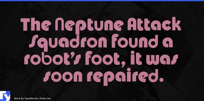
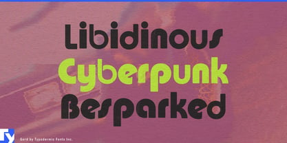
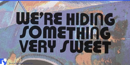
Buckle up and prepare for a typographic trip with Gord, a font that doesn’t just break the rules—it throws them out the window of a psychedelic Ford Pinto. This isn’t just a typeface; it’s a time machine disguised as letterforms, ready to catapult your designs straight into the heart of the 1970s.
Gord is what happens when a disco ball collides with the alphabet. It’s a glorious mishmash of styles, a typographic gumbo that shouldn’t work but somehow does—spectacularly. Each character is a celebration of imperfection, a rebellion against the sleek and the streamlined. It’s the typeface equivalent of platform shoes and a polyester suit: so outrageous it demands attention. But don’t be fooled by its seemingly haphazard appearance. Gord is intentionally, meticulously crafted chaos. Its uneven shapes and mismatched curves are carefully orchestrated to create a visual rhythm that’s as infectious as a funk bassline. It’s the kind of typeface that doesn’t just sit on the page—it grooves.
This font isn’t just for reading; it’s for experiencing. Use Gord, and watch as ordinary words transform into extraordinary visual adventures. It’s perfect for album covers that scream “vinyl revival,” posters that pop with retro energy, or branding that dares to be delightfully different. Gord doesn’t whisper; it bellows through a megaphone wrapped in shaggy carpeting. But Gord isn’t just about looking back—it’s about bringing the past into the future. Its support for a vast array of Latin-based European languages means this funky phonetic phenomenon is ready to boogie across borders. From the discotheques of Paris to the beach parties of Rio, Gord speaks the universal language of groove.
In a world of safe, sanitized design, Gord is your ticket to the wild side. It’s for designers who understand that sometimes, to make a real impact, you need to embrace the unconventional, the ugly-beautiful, the gloriously grotesque.
Diseñadores: Ray Larabie
Editorial: Typodermic
Fundición: Typodermic
Propietario del diseño: Typodermic
MyFonts debut: Feb 17, 2010
Gord
Acerca de Typodermic
Welcome to Typodermic Fonts, a spirited type foundry rooted in Nagoya, Japan, started by the Canadian typeface designer, Raymond Larabie in 2001. Our library brims with 500+ diverse typefaces to fuel creativity in graphic design, advertising, web, and app development. As digital type pioneers, we adopted web fonts and app licensing early, consistently pushing the design envelope. With Canadian heart and Japanese precision, we're your global partners in extraordinary typography. Explore Typodermic Fonts—where creativity meets character.
Seguir leyendo
Leer menos