


Seleccione este tipo de licencia cuando esté desarrollando una aplicación app para iOS, Android o Windows Phone, y vaya a incrustar el archivo en el código de su aplicación móvil. va a incrustar el archivo fuente en el código de su aplicación móvil.
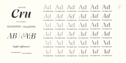
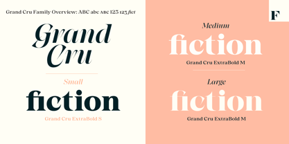
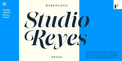
Grand Cru
por Fenotype
Estilos individuales desde $0.00 USD
Familia completa de 36 fuentes: $199.00 USD


Grand Cru Fuente La familia era
diseñada por
Emil Karl Bertell,
Erik Jarl Bertell,
Teo Tuominen y
publicado por
Fenotype. Grand Cru contiene
36
estilos y opciones de paquetes familiares.
Más información sobre esta familia
- Aa Glifos
-
¡Mejor PrecioPaquetes de familia
- Estilos individuales
- Especificaciones técnicas
- Licencias
Grand Cru S
12 fuentesPor Estilo:
$8.25 USD
Paquete de 12 estilos:
$99.00 USD
Grand Cru M
12 fuentesPor Estilo:
$8.25 USD
Paquete de 12 estilos:
$99.00 USD
Grand Cru L
12 fuentesPor Estilo:
$8.25 USD
Paquete de 12 estilos:
$99.00 USD
Sobre la familia Grand Cru Fuente
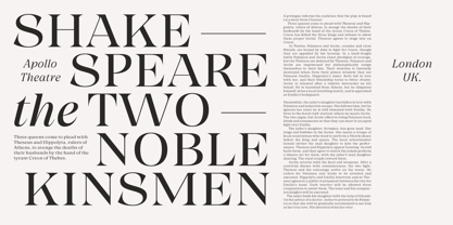
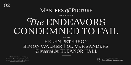
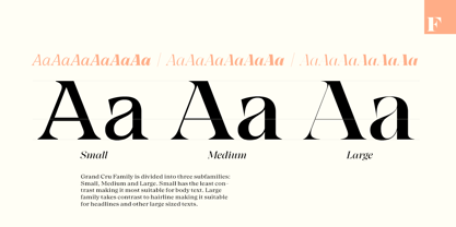
Meet Grand Cru – a new approach to serif type. The type family is divided to three groups – Small, Medium and Large – according to the amount of contrast in letterforms. Forget about those old Text/Display categories – it’s up to you how to use your typeface. While the Grand Cru Large fonts are highly decorative, the Small versions function as reliable workhorses.
All Grand Cru fonts come with thoughtful Open Type features – built-in small capitals are found in all of them, while the italics come with handsome Swash capitals. The romans are equipped with intelligent numeral styles including subscript and superscript and fractions.
Diseñadores: Emil Karl Bertell, Erik Jarl Bertell, Teo Tuominen
Editorial: Fenotype
Fundición: Fenotype
Propietario del diseño: Fenotype
MyFonts debut: Jan 22, 2021
Grand Cru
Acerca de Fenotype
Emil Bertell has done it all. Having published his first font files at 16, he was considered to be an international free-font hero while still in his teens. He went on to attend design college, drop out, and become a well-known graphic designer and illustrator. Now one of the most successful type designers from the Nordic countries on MyFonts, the Finland-based designer said in his Creative Characters interview that he’s “had an obsession with visual culture from the beginning.” Before turning his attention to type design full-time, Emil had a very successful career as an award-winning illustrator. “Illustration became my main livelihood,” he said. “I drew painstaking pencil illustrations for magazines, advertising, stamps, etc. I often designed my own fonts for festivals and hand-drew the lettering posters; I also did a few pencil illustrations based on lettershapes, and that got out of hand, so I had to do a lot more of them.” In 2012 he finally made the switch and committed all of his time to type design. Emil first saw success with his Billboard typeface. “It became my first Rising Star on MyFonts and made me realize that I could actually make a living by designing fonts,” he said. “I realized that there’s actually a market out there that I could become a part of.” Throughout the rest of that year he began to see even more success. It began in January, when his font, Mishka, was featured in our Most Popular Fonts of 2011 list. He went on to find a way to bookend the year and was listed among the Most Popular Fonts of 2012 with his Mercury Script design. Since then, his foundry’s success has continued on with best sellers like Voyage and The Carpenter. Fans of the foundry have a lot to look forward to in the near future. Emil will continue to produce beautiful scripts (some coming soon to MyFonts!) and has plans to expand his business.
Seguir leyendo
Leer menos
- Al seleccionar una opción, se actualiza toda la página.