


Seleccione este tipo de licencia cuando esté desarrollando una aplicación app para iOS, Android o Windows Phone, y vaya a incrustar el archivo en el código de su aplicación móvil. va a incrustar el archivo fuente en el código de su aplicación móvil.
Kaleko 205 Text
por Talbot Type
Estilos individuales desde $19.50 USD
Familia completa de 8 fuentes: $90.00 USD

Kaleko 205 Text Fuente La familia era
diseñada por
Adrian Talbot y
publicado por
Talbot Type. Kaleko 205 Text contiene
8
estilos y opciones de paquetes familiares.
Más información sobre esta familia
- Aa Glifos
-
¡Mejor PrecioPaquetes de familia
- Estilos individuales
- Especificaciones técnicas
- Licencias
Por Estilo:
$11.25 USD
Paquete de 8 estilos:
$90.00 USD
Kaleko 205 Text Light & Light Oblique
2 fuentesPor Estilo:
$13.00 USD
Paquete de 2 estilos:
$26.00 USD
Kaleko 205 Text Heavy & Heavy Oblique
2 fuentesPor Estilo:
$13.00 USD
Paquete de 2 estilos:
$26.00 USD
Kaleko 205 Text Book & Book Oblique
2 fuentesPor Estilo:
$13.00 USD
Paquete de 2 estilos:
$26.00 USD
Kaleko 205 Text Bold & Bold Oblique
2 fuentesPor Estilo:
$13.00 USD
Paquete de 2 estilos:
$26.00 USD
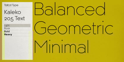
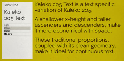
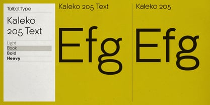
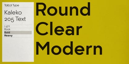
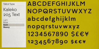
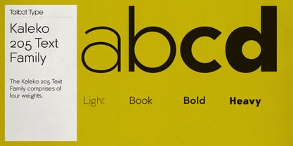
Sobre la familia Kaleko 205 Text Fuente
Kaleko 205 Text is the text specific variation of stablemate,
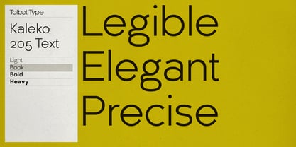
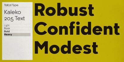
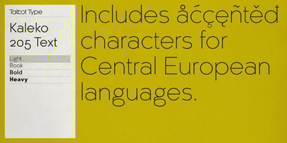
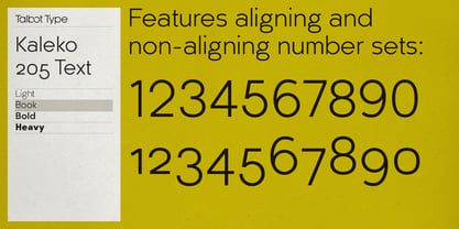
. With a shallower x-height and longer ascenders and descenders, its more traditional proportions make it more economical with space and better suited to continuous text. It's a well-balanced, versatile, modern sans, highly legible as a text font and with a clean, elegant look as a display font at larger sizes. The Kaleko 205 Text family comprises of four weights and includes old style non-aligning (lower case) numbers, both proportional and tabular as well as accented characters for Central European languages. It is closely related to
, which offers variations in some characters, most notably a single storey lower case a and g.
Diseñadores: Adrian Talbot
Editorial: Talbot Type
Fundición: Talbot Type
Propietario del diseño: Talbot Type
MyFonts debut: Aug 22, 2018
Kaleko 205 Text
Acerca de Talbot Type
Most of my fonts are influenced by the classic movements of the twentieth century — Modernism, the Bauhaus, Constructivism and Art Deco — I aspire to create timeless designs, valid now and in the future. These are not showy faces, but practical, hard-working text and display fonts. Occasionally I branch out into more experimental, display fonts, possibly as a result of my years as a graphic designer with a focus on identities and communications and the need to stand out from the crowd — in a good way.
Seguir leyendo
Leer menos
- Al seleccionar una opción, se actualiza toda la página.