


Seleccione este tipo de licencia cuando esté desarrollando una aplicación app para iOS, Android o Windows Phone, y vaya a incrustar el archivo en el código de su aplicación móvil. va a incrustar el archivo fuente en el código de su aplicación móvil.
Karben 205
por Talbot Type
Estilos individuales desde $19.50 USD
Familia completa de 10 fuentes: $99.00 USD

Karben 205 Fuente La familia era
diseñada por
Adrian Talbot y
publicado por
Talbot Type. Karben 205 contiene
10
estilos y opciones de paquetes familiares.
Más información sobre esta familia
- Aa Glifos
-
¡Mejor PrecioPaquetes de familia
- Estilos individuales
- Especificaciones técnicas
- Licencias
Por Estilo:
$9.90 USD
Paquete de 10 estilos:
$99.00 USD
Karben 205 Medium & Medium Oblique
2 fuentesPor Estilo:
$13.00 USD
Paquete de 2 estilos:
$26.00 USD
Karben 205 Light & Light Oblique
2 fuentesPor Estilo:
$13.00 USD
Paquete de 2 estilos:
$26.00 USD
Karben 205 Book & Book Oblique
2 fuentesPor Estilo:
$13.00 USD
Paquete de 2 estilos:
$26.00 USD
Karben 205 Bold & Bold Oblique
2 fuentesPor Estilo:
$13.00 USD
Paquete de 2 estilos:
$26.00 USD
Karben 205 Black + Oblique
2 fuentesPor Estilo:
$13.00 USD
Paquete de 2 estilos:
$26.00 USD
Karben 205 Black & Black Oblique
2 fuentesPor Estilo:
$13.00 USD
Paquete de 2 estilos:
$26.00 USD
Sobre la familia Karben 205 Fuente
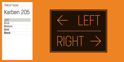
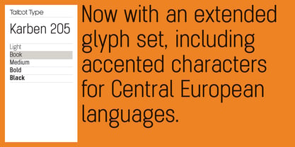
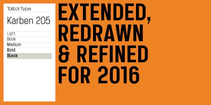
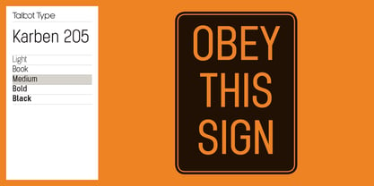
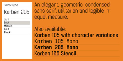
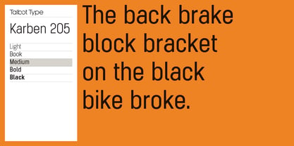
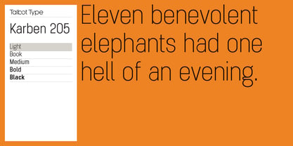
Karben 205 is inspired by the classic, no nonsense DIN, and has a form that follows its highly legible function. Based on a lozenge, it has a clean and pure geometry with even stroke weights. Karben 205 is available in a family of five weights, and is also available with character variations as Karben 105. There are also monospaced variants of both Karben 105 and Karben 205 and a stencil version. All of the Karben fonts feature an extended character set, including accented characters for Central European languages.
Diseñadores: Adrian Talbot
Editorial: Talbot Type
Fundición: Talbot Type
Propietario del diseño: Talbot Type
MyFonts debut: Oct 17, 2012
Karben 205

Acerca de Talbot Type
Most of my fonts are influenced by the classic movements of the twentieth century — Modernism, the Bauhaus, Constructivism and Art Deco — I aspire to create timeless designs, valid now and in the future. These are not showy faces, but practical, hard-working text and display fonts. Occasionally I branch out into more experimental, display fonts, possibly as a result of my years as a graphic designer with a focus on identities and communications and the need to stand out from the crowd — in a good way.
Seguir leyendo
Leer menos
- Al seleccionar una opción, se actualiza toda la página.