


Seleccione este tipo de licencia cuando esté desarrollando una aplicación app para iOS, Android o Windows Phone, y vaya a incrustar el archivo en el código de su aplicación móvil. va a incrustar el archivo fuente en el código de su aplicación móvil.
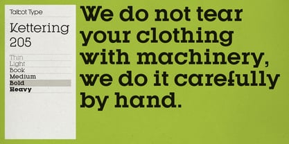
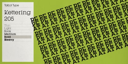
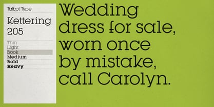
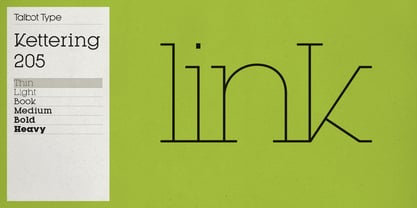
Kettering 205
por Talbot Type
Estilos individuales desde $12.99 USD
Familia completa de 12 fuentes: $99.00 USD

Kettering 205 Fuente La familia era
diseñada por
Adrian Talbot y
publicado por
Talbot Type. Kettering 205 contiene
12
estilos y opciones de paquetes familiares.
Más información sobre esta familia
- Aa Glifos
-
¡Mejor PrecioPaquetes de familia
- Estilos individuales
- Especificaciones técnicas
- Licencias
Basic typesetting
Letter case
Numerals and scientific typesetting
Typographic variants
Restablecer
Kettering 205 Medium & Medium Oblique
2 fuentesPor Estilo:
$9.99 USD
Paquete de 2 estilos:
$19.99 USD
Kettering 205 Light & Light Oblique
2 fuentesPor Estilo:
$9.99 USD
Paquete de 2 estilos:
$19.99 USD
Kettering 205 Heavy & Heavy Oblique
2 fuentesPor Estilo:
$9.99 USD
Paquete de 2 estilos:
$19.99 USD
Kettering 205 Book & Book Oblique
2 fuentesPor Estilo:
$9.99 USD
Paquete de 2 estilos:
$19.99 USD
Kettering 205 Bold & Bold Oblique
2 fuentesPor Estilo:
$9.99 USD
Paquete de 2 estilos:
$19.99 USD
Sobre la familia Kettering 205 Fuente
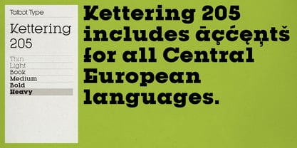
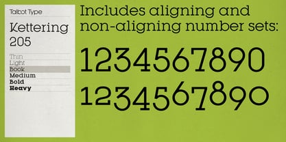
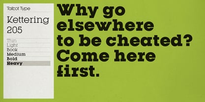
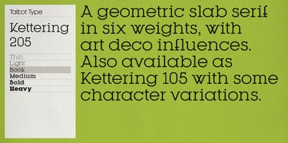
Kettering 205 is a geometric slab-serif with Art Deco influences, such as lowered crossbars on many characters, and a crossed W. It includes old style non-aligning (lower case) numbers, both proportional and tabular as well as accented characters for Central European languages. It’s a highly individual looking font, but retains good legibility coupled with striking looks as a display font. The Kettering 205 family comprises of six weights and is closely related to Kettering 105, its less Deco flavoured cousin.
Diseñadores: Adrian Talbot
Editorial: Talbot Type
Fundición: Talbot Type
Propietario del diseño: Talbot Type
MyFonts debut: May 30, 2012
Kettering 205

Acerca de Talbot Type
Most of my fonts are influenced by the classic movements of the twentieth century — Modernism, the Bauhaus, Constructivism and Art Deco — I aspire to create timeless designs, valid now and in the future. These are not showy faces, but practical, hard-working text and display fonts. Occasionally I branch out into more experimental, display fonts, possibly as a result of my years as a graphic designer with a focus on identities and communications and the need to stand out from the crowd — in a good way.
Seguir leyendo
Leer menos