


Seleccione este tipo de licencia cuando esté desarrollando una aplicación app para iOS, Android o Windows Phone, y vaya a incrustar el archivo en el código de su aplicación móvil. va a incrustar el archivo fuente en el código de su aplicación móvil.
Kisba Nova
por Identity Letters
Estilos individuales desde $29.00 USD
Familia completa de 14 fuentes: $159.00 USD

Kisba Nova Fuente La familia era
diseñada por
Moritz Kleinsorge y
publicado por
Identity Letters. Kisba Nova contiene
14
estilos y opciones de paquetes familiares.
Más información sobre esta familia
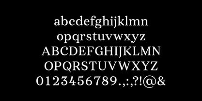
- Aa Glifos
-
¡Mejor PrecioPaquetes de familia
- Estilos individuales
- Especificaciones técnicas
- Licencias
Basic typesetting
Letter case
Numerals and scientific typesetting
Typographic variants
Restablecer
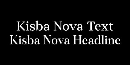
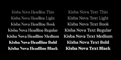
Kisba Nova Text
7 fuentesPor Estilo:
$11.28 USD
Paquete de 7 estilos:
$79.00 USD
Kisba Nova Headline
7 fuentesPor Estilo:
$11.28 USD
Paquete de 7 estilos:
$79.00 USD
Sobre la familia Kisba Nova Fuente
Kisba Nova – A character actor that turns heads. Spiky serifs, soft ball terminals.
All eyes on Kisba Nova: enter a typeface designed to arouse attention. Kisba Nova is that one guest who joins a party, and a murmur goes through the crowd. Kisba Nova is pure charisma.
Opposites attract: Kisba Nova combines sharp wedge serifs and spiky spurs with round and soft ball terminals. Infuse this with a neoclassical stroke contrast and you get a thrilling typeface driven by visual extremes.
Sure: Kisba Nova is a diva. But it’s a pro, after all. That’s why it comes in two optical sizes: Headline and Text. This makes sure it looks gorgeous in any situation.
The Kisba Nova Headline subfamily is flaunts the trademark flamboyant looks and extravagant letters like f and k. They bring you all of the excitement of the showbiz in large applications—use it for sizes of 24 Pt. and more. The extraordinarily designed, thin and monolinear diacritics, punctuation marks, and symbols of Kisba Nova Headline add to this modern and elegant character.
Kisba Nova Headline consists of seven weights from Thin to Black, offering plenty of possibilities to set headlines and titles. With about 600 characters per weight, it contains enough functionality for the demands of a skilled typographer. OpenType features, such as a large set of ligatures, extended language support, case-sensitive forms, different sets of figures, and arrows, enable sensational designs both in web & print layouts.
The Kisba Nova Text subfamily comes with decreased contrast, more generous letter proportions, and wider spacing. Instead of employing flashy thin and monolinear diacritics, punctuation marks, and symbols, Kisba Nova Text aims for a more even texture on the page. It retains the true, elegant Kisba DNA while allowing you to set legible copy in sizes between 9 and 18 Pt. Nothing will distract your reader–Kisba Nova Text aims to please.
Kisba Nova Text consists of seven weights from Thin to Black, offering plenty of possibilities to set body copy and subheadlines. With about 600 characters per weight, it contains enough functionality for the demands of a skilled typographer. OpenType features, such as a large set of ligatures, extended language support, case-sensitive forms, different sets of figures, and arrows, enable sensational designs both in web & print layouts.
Kisba Nova celebrates the dual nature of softness and sharpness in a single typeface. It’s a character actor that turns heads.
Diseñadores: Moritz Kleinsorge
Editorial: Identity Letters
Fundición: Identity Letters
Propietario del diseño: Identity Letters
MyFonts debut: Jul 13, 2021
Kisba Nova
Acerca de Identity Letters
Identity Letters is a boutique type foundry based in Germany, close to the Dutch border—an ideal place for a straightforward type business. It’s fueled by the cosmopolitan spirit of the Rhine-Ruhr metropolitan region, close to the cities of Cologne and Düsseldorf, and informed by a rich cultural history whose traces are ubiquitous in the area. Here we work hard to provide businesses and creatives anywhere in the world with power...
Seguir leyendo