


Seleccione este tipo de licencia cuando esté desarrollando una aplicación app para iOS, Android o Windows Phone, y vaya a incrustar el archivo en el código de su aplicación móvil. va a incrustar el archivo fuente en el código de su aplicación móvil.
Librum
por Hackberry Font Foundry
Estilos individuales desde $24.95 USD
Familia completa de 4 fuentes: $74.95 USD

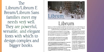
Librum Fuente La familia era
diseñada por
David Bergsland y
publicado por
Hackberry Font Foundry. Librum contiene
4
estilos y opciones de paquetes familiares.
Más información sobre esta familia
- Aa Glifos
-
¡Mejor PrecioPaquetes de familia
- Estilos individuales
- Especificaciones técnicas
- Licencias
Por Estilo:
$18.73 USD
Paquete de 4 estilos:
$74.95 USD
Sobre la familia Librum Fuente
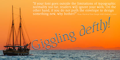
This is the serif text family for the book design group of font families which David designed in the process of writing "Practical Font Design With FontLab 5". The letterspacing is set wide for body copy use. The main purpose is readability and reading comfort. There are several whimsical graphics, plenty of OpenType features: oldstyle figures [tabular and not], small cap figures, lining figures [tabular and not], discretionary ligatures, small caps, and so on. The feature set is limited for the italic and bold versions. It produces an exceptional book. See Librum Book Design Group for a package containing all fifteen fonts,
Diseñadores: David Bergsland
Editorial: Hackberry Font Foundry
Fundición: Hackberry Font Foundry
Propietario del diseño: Hackberry Font Foundry
MyFonts debut: Jan 19, 2016
Librum

Acerca de Hackberry Font Foundry
- The Hackberry Font Foundry was founded in the 1998 to sell the fonts David Bergsland designed to be used in his digital publishing training books.
- The goal of David’s fonts is to add a hand-drawn edge to them. In this age of increasing technological “slickness” he purposely loosens the structure and adds “air” to the glyphs with breaks.
- All fonts are designed as OpenType Pro fonts with special production features. Almost all of the fonts have oldstyle numbers as well as small cap figures, plus small caps, discretionary ligatures & special dingbats.
- They really shine in book production.
- The production families have contrasting serif and sans serif families both using the same vertical font metrics—for run-in heads and the like.
- At present he mainly writes and designs books.
Seguir leyendo
Leer menos
- Al seleccionar una opción, se actualiza toda la página.