


Seleccione este tipo de licencia cuando esté desarrollando una aplicación app para iOS, Android o Windows Phone, y vaya a incrustar el archivo en el código de su aplicación móvil. va a incrustar el archivo fuente en el código de su aplicación móvil.
Lingua
por JOEBOB graphics
Estilos individuales desde $30.00 USD

Lingua Fuente La familia era
diseñada por
Geert Dijkers y
publicado por
JOEBOB graphics. Lingua contiene
1
estilos.
Más información sobre esta familia
Sobre la familia Lingua Fuente
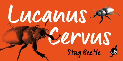
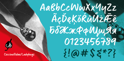
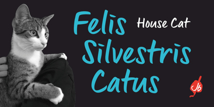
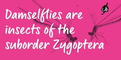
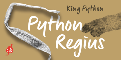
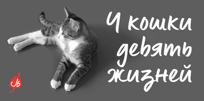
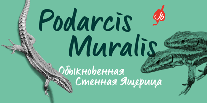
Lingua is the unlikely offspring of our CAPUT font. Wondering what the undercast characters of this font would look like, I started writing. I was pleased with the first results and this encouraged me to pursue the process. The final font still has some slight resemblance to its predecessor, but stands completely on its own. This bold, sturdy typeface is very suitable for headers, posters and other designs where large sizes are needed. It comes with both a western and a cyrillic character set.
Diseñadores: Geert Dijkers
Editorial: JOEBOB graphics
Fundición: JOEBOB graphics
Propietario del diseño: JOEBOB graphics
MyFonts debut: Mar 17, 2021
Lingua

Acerca de JOEBOB graphics
At JOEBOB graphics we like to write. And we like to keep it real.We create our handwritten fonts in such a way that they end up looking like handwriting, not like polished scripts. We do so because we think it’s a good idea to establish a natural feel to our fonts and aim for character and intention over perfection. Little flaws we make while writing are welcomed and left in on purpose because we think it contributes to the idea of being human in an increasingly digital world.Foundry of Jeroen “Joebob” van der Ham.
Seguir leyendo
Leer menos
- Al seleccionar una opción, se actualiza toda la página.