


Seleccione este tipo de licencia cuando esté desarrollando una aplicación app para iOS, Android o Windows Phone, y vaya a incrustar el archivo en el código de su aplicación móvil. va a incrustar el archivo fuente en el código de su aplicación móvil.
Magnat
por René Bieder
Estilos individuales desde $29.00 USD
Familia completa de 36 fuentes: $179.00 USD


Magnat Fuente La familia era
diseñada por
René Bieder y
publicado por
René Bieder. Magnat contiene
36
estilos y opciones de paquetes familiares.
Más información sobre esta familia
- Aa Glifos
-
¡Mejor PrecioPaquetes de familia
- Estilos individuales
- Especificaciones técnicas
- Licencias
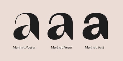
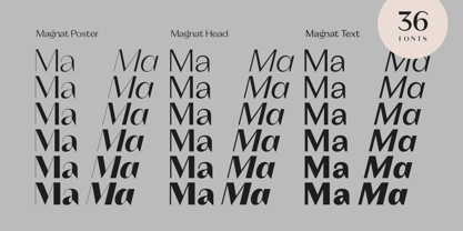
Magnat Text
12 fuentesPor Estilo:
$10.75 USD
Paquete de 12 estilos:
$129.00 USD
Magnat Poster
12 fuentesPor Estilo:
$10.75 USD
Paquete de 12 estilos:
$129.00 USD
Magnat Head
12 fuentesPor Estilo:
$10.75 USD
Paquete de 12 estilos:
$129.00 USD
Sobre la familia Magnat Fuente
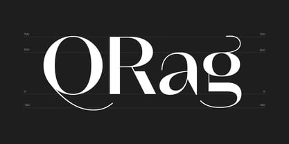
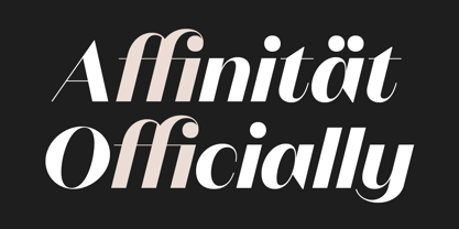
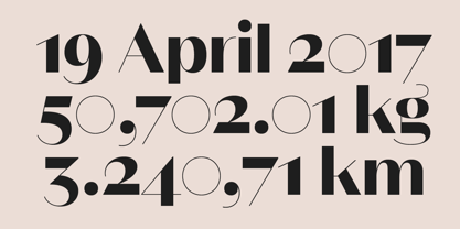
Magnat is a contrasting sans drawing inspiration from designs from the early twenties century and expands them into an elegant and distinctive contemporary design. Playful elements such as the curvy ear on the lowercase g or the long tail on the uppercase Q break the strictness and add character. The combination of closed apertures with the contrasting strokes create an elegant and distinctive overall appearance. The Magnat family is available in 36 weights including matching italics, divided into 3 subfamilies: Poster, Head and Text. Each has been designed for its individual range of text sizes. The Poster and Head styles with their tight spacing and luxurious shapes are made for impactful headlines and short paragraphs, whereas the text weights are either a great addition for small text sizes or, when set in large sizes, perfectly work as a robust standalone font with a lot of character. Each font style is equipped with many opentype features such as alternate characters, different number sets or case sensitive shapes making it a perfect choice for professional type setting in branding, editorial or digital design.
Diseñadores: René Bieder
Editorial: René Bieder
Fundición: René Bieder
Propietario del diseño: René Bieder
MyFonts debut: Apr 24, 2019
Magnat

Acerca de René Bieder
René Bieder (*1982) is a trained Graphic designer and Art Director and self taught type designer. Before setting up his own studio as a type designer in 2013, he was employed in various small and large advertising agencies as an Art Director and Graphic Designer working for national and international clients. During his agency time he developed a deep interest in type design and started designing typefaces as a side project. His second commercial release has won the title "Myfonts Most popular typeface of the year 2012". Since then his typefaces were a constant on the Myfonts best seller lists. Today, you can find his work all around the world. From the Nemo Science Museum in Amsterdam to the University of Florida.The Premium foundry page can be viewed Here.
Seguir leyendo
Leer menos
- Al seleccionar una opción, se actualiza toda la página.