


Seleccione este tipo de licencia cuando esté desarrollando una aplicación app para iOS, Android o Windows Phone, y vaya a incrustar el archivo en el código de su aplicación móvil. va a incrustar el archivo fuente en el código de su aplicación móvil.
Mucho Sans
por Fontforecast
Estilos individuales desde $17.00 USD
Familia completa de 12 fuentes: $89.00 USD

Mucho Sans Fuente La familia era
diseñada por
Hanneke Classen y
publicado por
Fontforecast. Mucho Sans contiene
12
estilos y opciones de paquetes familiares.
Más información sobre esta familia
- Aa Glifos
-
¡Mejor PrecioPaquetes de familia
- Estilos individuales
- Especificaciones técnicas
- Licencias
Sobre la familia Mucho Sans Fuente
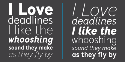
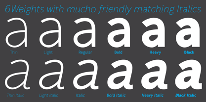
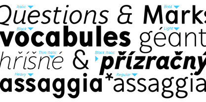
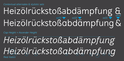
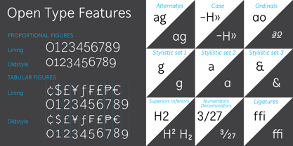
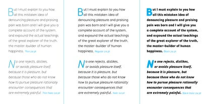
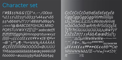
Mucho Sans is a geometric sans serif type family that comes in six weights with matching Italics. The design is very clean, yet friendly and modern. Some of its characteristics are the generous x-height, the Ascender-height that matches the Cap-height, the friendly looking real italics and the low contrast. The result is a contemporary versatile type family that is excellently suited for both display and text uses and that supports a wide range of languages. Mucho Sans is equipped with many Opentype features such as five numeral styles, numerators, denominators, superiors, inferiors, automatic fractions, alternative a and g, case sensitive forms and ordinals.
Diseñadores: Hanneke Classen
Editorial: Fontforecast
Fundición: Fontforecast
Propietario del diseño: Fontforecast
MyFonts debut: Sep 5, 2015
Mucho Sans
Acerca de Fontforecast
Hanneke Classen started Fontforecast in 2013 as a label of Storm Creative Consultancy, an advertising agency where she works to this day as a graphic and type designer. “Working with fonts as a designer day in, day out made me curious about the process of designing fonts,” she says. “As soon as I dived into the ins and outs of font design, I was hooked.” It was in that same year that she finished work on her first two font families: Tyfoon Sans and Tyfoon Script. “The concept was to combine two very different designs in such a way that they work together well. By using the same measurements as a skeleton for both font families they became interchangeable, even in the same sentence, without causing leading problems.” “The concept of making font families consisting of different designs especially made to complement and support each other was relatively new at the time Fontforecast started,” Hanneke says. “My aim is to give all of my font families a certain something extra.” This drive to push the envelope gave way to bestselling typefaces Chameleon, a design kit of 16 fonts intended to bring a personalized touch to any project, and Salt & Spices Pro, a modern collection of 9 calligraphy fonts that brings to life an authentic feel of vintage dip pen calligraphy. There is much to look forward to in the future from the Netherland-based foundry. Marloes Versluys, an Amsterdam-based art director, graphic designer and type designer, is joining the foundry and working with Hanneke to continue making a wide variety of typefaces perfect for any, and all projects.
Seguir leyendo
Leer menos
- Al seleccionar una opción, se actualiza toda la página.