


Seleccione este tipo de licencia cuando esté desarrollando una aplicación app para iOS, Android o Windows Phone, y vaya a incrustar el archivo en el código de su aplicación móvil. va a incrustar el archivo fuente en el código de su aplicación móvil.
Nawin Arabic
por Letterjuice
Estilos individuales desde $33.00 USD
Familia completa de 4 fuentes: $150.00 USD

Nawin Arabic Fuente La familia era
diseñada por
Pilar Cano,
Ferran Milan y
publicado por
Letterjuice. Nawin Arabic contiene
4
estilos y opciones de paquetes familiares.
Más información sobre esta familia
- Aa Glifos
-
¡Mejor PrecioPaquetes de familia
- Estilos individuales
- Especificaciones técnicas
- Licencias
Por Estilo:
$37.50 USD
Paquete de 4 estilos:
$150.00 USD
Sobre la familia Nawin Arabic Fuente
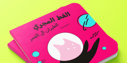
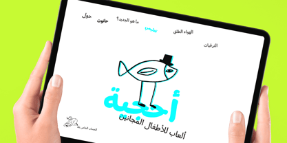
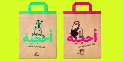
Nawin is an informal Arabic typeface inspired by handwriting. The idea behind this design is to create a type family attractive and ownable for children but at the same time a design that keeps excellent letter recognition for reading. Handwriting has been a great source of inspiration in this particular typeface. By emulating the movements of the pen, we have obtained letter shapes that express spontaneity. A bright group of letters create a lively and beautiful paragraph of text.
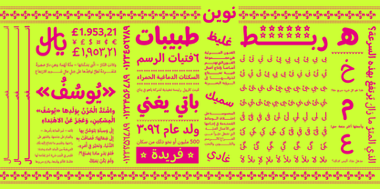
To get closer to handwriting and the variety of letter shapes that we draw while writing, this typeface offers a large number of alternative characters, which differ slightly from the default ones. Because we have programed the «Contextual Alternate» feature in the fonts, these alternate characters appear automatically as you set a text on your computer.
The proportions and letter shapes are flexible, escaping from tradition to increase expressivity and personality in the design. For instance, variability on vertical proportions between letters Alef and initial Lam, create movement in text and avoid the cold mechanical feel of repetition. Nawin is quirky and elegant at the same time.
Letter recognition is relevant when reading continuous text. For this reason, we have added another contextual alternate feature with alternate characters that help to avoid confusion when letters with similar or the same shape repeat inside one word. For instance, this is the case of medial «beh and Yeh» repeated three times continuously in the same word. The alternate characters change in shape and length, facilitating distinction to the reader.
Since this typeface is inspired by handwriting and the free movement of the hand while writing, we considered ligatures a good asset for this design. The typeface has a wide range of ligatures that enhance movement and fluidity in text making look text alive.
Diseñadores: Pilar Cano, Ferran Milan
Editorial: Letterjuice
Fundición: Letterjuice
Propietario del diseño: Letterjuice
MyFonts debut: Apr 7, 2022
Nawin Arabic

Acerca de Letterjuice
We are a small foundry and type design studio based in Barcelona and Buenos Aires run by two designers experienced in many different fields surrounding type design, typography, lettering, visual communication, branding, and teaching.We specialise in letters in a broad sense, from type design to lettering, from Latin to Arabic, passing through other scripts such as Armenian, Georgian, Greek, Cyrillic, Hebrew and Thai. We are surrounded by a network of bright collaborators and consultants in order to ensure the best possible quality. Our work has been recognised internationally in several type competitions such us TDC, ED-Awards, Morisawa, Granshan, Modern Cyrillic and Horouf.Our type library is a manifestation of our personal curiosity and our experimentation ground. We enjoy having room to explore our creativity within the boundaries of functionality, we hope you like what you see!
Seguir leyendo
Leer menos
- Al seleccionar una opción, se actualiza toda la página.