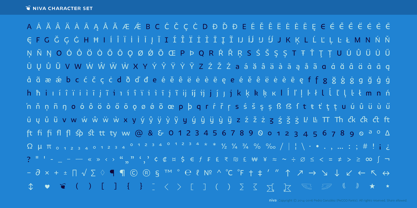
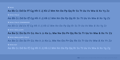
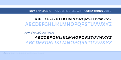
Ir directamente al contenido
Inicio / Fonts / PeGGO Fonts / Niva
Niva

Niva

por PeGGO Fonts
Estilos individuales desde $29.00 USD
Familia completa de 60 fuentes: $1,044.00 USD
Niva Fuente La familia era diseñada por Pedro Gonzalez Jorquera y publicado por PeGGO Fonts. Niva contiene 60 estilos y opciones de paquetes familiares.

Más información sobre esta familia
30 DÍAS DE PRUEBA GRATUITOS de Monotype Fonts para obtener más de 150.000 fuentes de más de 1.400 fundiciones tipográficas. Iniciar prueba gratuita
Iniciar prueba gratuita

Sobre la familia Niva Fuente


Niva is a display family font with 6 typographical groups in 10 weights each one, including a standard version, 2 italic widths, an alternative version and true small caps with italic version too. The creative idea follows concepts like future, technology, science, the structural principle focus in simplify complex details on letterforms ‘clean corners’ giving a luminous and sophisticated design with a ‘technologique’ touch, built in legible proportions which works as well as ‘display (titles)’ and even at small ‘text’ requirements. Specially recommended to be applied on digital and prints contexts as magazines, books, printed ads, UI & website design, digital graphics, video and TV screen contents as videogames and mobile apps.

Diseñadores: Pedro Gonzalez Jorquera

Editorial: PeGGO Fonts

Fundición: PeGGO Fonts

Propietario del diseño: PeGGO Fonts

MyFonts debut: Mar 8, 2016

Niva

Acerca de PeGGO Fonts

“Peggo Fonts” is a Chilean based foundry, founded in 2002 by Pedro González, with more than 20 years doing fonts for you and more than 14 years on the market, on early stages Peggo Fonts started as a calligraphy design studio, so, we still love doing (and teaching) “real calligraphy” that we take as inspiration, we still love doing lettering and do technical type drawings as detailed and deep reference for our type design, always through a critical and fresh scope, analyzing and solving our constant global needs for design.We put all our energy on fine tunning a balance between function and aesthetics for the sake of better design and a more pleasant reading experience. We work on do optical adjustments, on programing useful opentype features and finding innovative design concepts.

Seguir leyendo

Leer menos