


Seleccione este tipo de licencia cuando esté desarrollando una aplicación app para iOS, Android o Windows Phone, y vaya a incrustar el archivo en el código de su aplicación móvil. va a incrustar el archivo fuente en el código de su aplicación móvil.
Pagewalker
por Kostic
Estilos individuales desde $40.00 USD
Familia completa de 6 fuentes: $140.00 USD

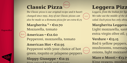
Pagewalker Fuente La familia era
diseñada por
Nikola Kostić y
publicado por
Kostic. Pagewalker contiene
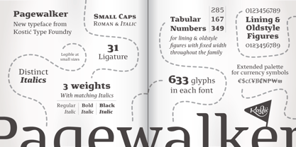
6
estilos y opciones de paquetes familiares.
Más información sobre esta familia
- Aa Glifos
-
¡Mejor PrecioPaquetes de familia
- Estilos individuales
- Especificaciones técnicas
- Licencias
Por Estilo:
$23.33 USD
Paquete de 6 estilos:
$140.00 USD
Sobre la familia Pagewalker Fuente
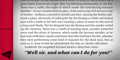
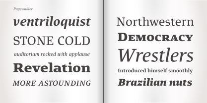
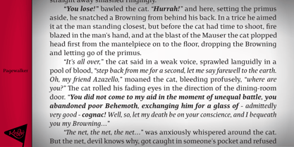
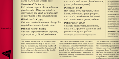
The name of the font is chosen to suggest its main purpose—setting multiple pages of text. All the features in this family were made with that in mind—legibility, distinct italics, small caps and various OpenType features, all make this font a useful tool for typographers. On the other hand, for packaging, posters, logotypes, etc. setting heavier weights in large size brings out its display qualities. Pagewalker is very legible and appears to be larger than other text typefaces. That is because the lower-case characters are made large compared to the capital letters. This means it can be used for setting text in, e.g. 9 pt size—while appearing to be 10 pt, but occupying less space.
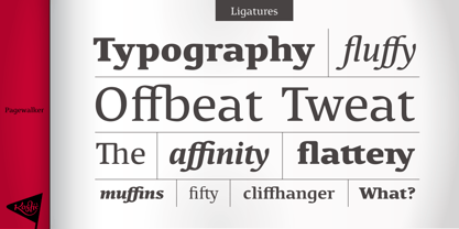
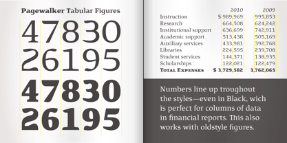
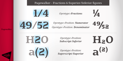
Pagewalker has a character set to support Western and Central European languages, and an extended set for monetary symbols which, in combination with tabular numbers, is perfect for financial reports. Each weight includes small caps, ligatures, proportional lining and oldstyle numbers, tabular figures, fractions and scientific superior/inferior figures.
Diseñadores: Nikola Kostić
Editorial: Kostic
Fundición: Kostic
Fundición original: Kostic
Propietario del diseño: Kostic
MyFonts debut: Aug 10, 2011
Pagewalker
Acerca de Kostic
Kostić Type Foundry is a small, independent type foundry run by the father-and-son team Zoran and Nikola Kostić. Zoran began designing fonts in 1987 out of necessity—his DTP studio required PostScript Cyrillic fonts, which were unavailable at the time. What started as a practical need soon became a lifelong passion, leading him to create numerous original typefaces, including Batke, Beograd, KosticSans, KosticSerif, Lapidary Capitals, Sketch, DesignerRound, Why Square, and Just Square (both licensed by Linotype). After closing his studio in 2004, Zoran dedicated himself to the digital preservation of medieval manuscripts from the Hilandar Monastery. To support this work, he developed complex typefaces based on Old Church Slavonic scripts, such as Hilandarski Ustav and Monah, each containing over 6,400 characters. Nikola grew up surrounded by the creative energy of his father’s DTP studio in the late '80s. After earning a master’s degree from the Faculty of Applied Arts at the University of Arts in Belgrade, he initially pursued a career in graphic design. However, in 2011, he decided to design his first commercial typeface and turned to Zoran for guidance in font production. When the font sold a license on its very first day of distribution, there was no turning back—Nikola shifted his focus entirely to type design. By 2021, Nikola had built a diverse library of typefaces, including Chiavettieri, Altivo, Roc Grotesk, and Rizado Script. As his passion for type design grew, so did his expertise. After Zoran retired in 2018, Nikola, who was already focused on design, took on the technical aspects as well, overseeing every stage of font production. His work has earned critical acclaim and prestigious design awards from some of the world’s leading typographic organizations. Kostić Type Foundry’s typefaces have reached millions of designers worldwide, appearing in everything from U.S. presidential campaign to local grocery store logos—a testament to the global impact of their craft.
Seguir leyendo
Leer menos
- Al seleccionar una opción, se actualiza toda la página.