


Seleccione este tipo de licencia cuando esté desarrollando una aplicación app para iOS, Android o Windows Phone, y vaya a incrustar el archivo en el código de su aplicación móvil. va a incrustar el archivo fuente en el código de su aplicación móvil.
PF DIN Serif™
por Parachute
Estilos individuales desde $36.00 USD
Familia completa de 10 fuentes: $495.00 USD

PF DIN Serif Fuente La familia era
diseñada por
Panos Vassiliou y
publicado por
Parachute. PF DIN Serif contiene
10
estilos y opciones de paquetes familiares.
Más información sobre esta familia
- Aa Glifos
-
¡Mejor PrecioPaquetes de familia
- Estilos individuales
- Especificaciones técnicas
- Licencias
Por Estilo:
$49.50 USD
Paquete de 10 estilos:
$495.00 USD
Sobre la familia PF DIN Serif Fuente
DIN Serif: Specimen Manual PDF
The DIN Type System: A Comparison Table
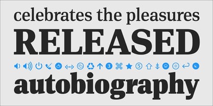
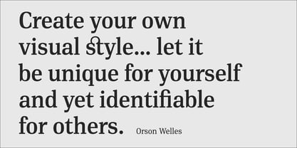
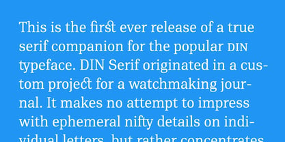
This is the first ever release of a true serif companion for the popular DIN typeface. DIN Serif originated in a custom project for a watchmaking journal which required a modern serif to work in unison and match the inherent simplicity of DIN. As a result, a solid, confident and well-balanced typeface was developed which is simple and neutral enough when set at small sizes, but sturdy and powerful when set at heavier weights and bigger sizes. It utilizes the skeleton of the original DIN and retains its basic proportions such as x-height, caps height and descenders, whereas ascenders were slightly increased.
DIN Serif makes no attempt to impress with ephemeral nifty details on individual letters, but instead it concentrates on a few modern, functional and everlasting novelties which express an overall distinct quality on the page and set it apart from most classic romans.
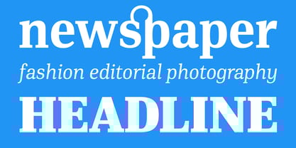
This is a low contrast typeface with vertical axis and squarish form which brings out a balance between simplicity and legibility. Its narrow proportions offer economy of space which is critical for newspaper body text and headlines. At small sizes the text has an even texture, it is comfortable and highly readable. The serifs are narrow at heavy weights and when tight typesetting is applied at large sizes, the heavier weights become ideal for headlines.
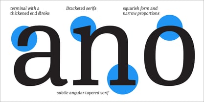
DIN Serif was inspired by late 19th century Egyptian and earlier transitional roman faces. Bracketed serifs were placed on the upper part of the letterforms (this is where we mostly concentrate our attention when we read) whereas small clean square serifs were placed on and under the baseline to simplify the letterforms. In order to reduce visual tension at the joins and make reading smooth and comfortable, a slight hint of bracketed serif was added at the joins in the form of a subtle angular tapered serif, which softens the harsh angularity. These angular tapered serifs tend to disappear at smaller sizes (or smooth out the joins) but stand out at bigger sizes exuding a strong, modern and energetic personality.
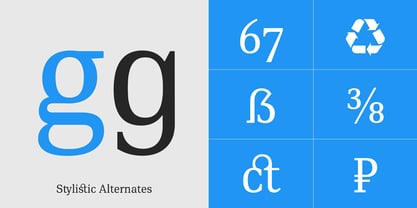
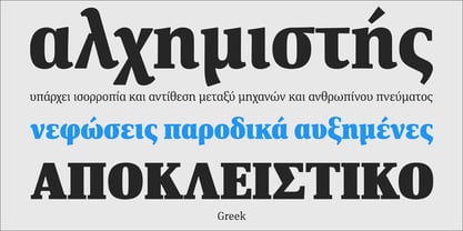
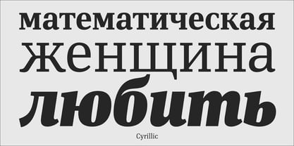
What started out as a custom 2 weight family, it has developed into a full scale superfamily with 10 styles from Regular to ExtraBlack along with their italics. Additional features were added such as small caps, alternate letters and numbers as well as numerous symbols for branding, signage and publishing. All weights were meticulously hinted for excellent display performance on the web. Finally, DIN Serif supports more that 100 languages such as those based on the Latin, Greek and Cyrillic alphabet.
Diseñadores: Panos Vassiliou
Editorial: Parachute
Fundición: Parachute
Propietario del diseño: Parachute
MyFonts debut: Jun 8, 2016
PF DIN Serif™
is a trademark of Parachute and may be registered in certain jurisdictions.

Acerca de Parachute
Parachute is a digital type foundry and design agency, specialising in bespoke type design, corporate typefaces and lettering. We use the power of typography to transform living brands to global brands, enrich their identity and localise their language in emerging markets. We have collaborated with several leading organisations since 2001 and designed proprietary typefaces for some of the world’s most iconic brands and institutions such as Bank of America, Apple, European Commission, National Geographic, Ikea, Kraft Foods, UEFA, Samsung, Financial Times, Pernod Ricard, Ogilvy, Emirates. Our work has earned numerous accolades around the world with top honours from TDC, Red Dot, European Design Awards, Tokyo TDC, HiiiBrand, Granshan Awards, Communication Arts and many others.
Seguir leyendo
Leer menos
- Al seleccionar una opción, se actualiza toda la página.