


Seleccione este tipo de licencia cuando esté desarrollando una aplicación app para iOS, Android o Windows Phone, y vaya a incrustar el archivo en el código de su aplicación móvil. va a incrustar el archivo fuente en el código de su aplicación móvil.
PF Lindemann Sans™
por Parachute
Estilos individuales desde $49.00 USD
Familia completa de 12 fuentes: $425.00 USD

PF Lindemann Sans Fuente La familia era
diseñada por
Chad Lindemann y
publicado por
Parachute. PF Lindemann Sans contiene
12
estilos y opciones de paquetes familiares.
Más información sobre esta familia
- Aa Glifos
-
¡Mejor PrecioPaquetes de familia
- Estilos individuales
- Especificaciones técnicas
- Licencias
Sobre la familia PF Lindemann Sans Fuente
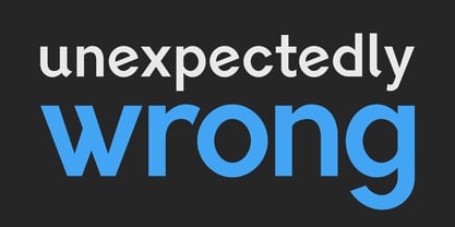
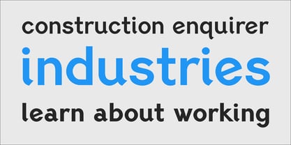
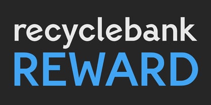
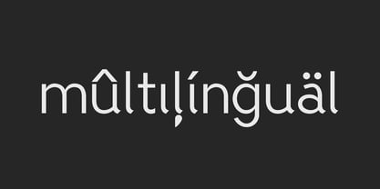
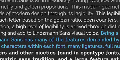
Lindemann Sans is an immediately-inviting typeface with a pleasing distinct visual voice grounded by geometry and golden proportions.
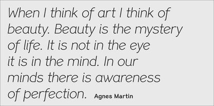
This modern geometric san serif typeface serves the interpretive needs of modern design through its legibility. This legibility is achieved through proportional balance of each letter based on the golden ratio, open counters, high x-height and wider individual shapes. In addition, a high level of legibility is arrived through distinctive glyphs like a, e, @, and f, which are engaging and add to Lindemann Sans visual voice.
Being a modern, spirited, tech-savvy typeface, Lindemann Sans has many of the features demanded by today's designers. These features include 800 characters within each font, many ligatures, full numbers sets, small caps, alternative characters and other niceties found in opentype fonts.
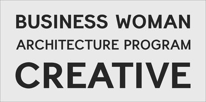
Due to Lindemann Sans high legibility, geometric sans tradition, and a large feature set list, it is a very versatile typeface and can be used in replacement of the more commonly used sans. Specifically, Lindemann Sans can be used by technology corporations, architectural firms in their supporting materials, in magazines as headers and key-points, as the typeface for professional keynotes, for the package design industry as a whole, in automotive concept projects, and for cosmetic branding for high class hair products. With its inviting nature it may also be used for liberal arts promotional materials. In addition, this typeface can be used by green industries because of its nature derived proportions.
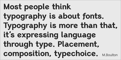
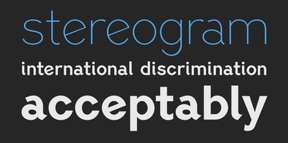
Each style and weight of Lindemann Sans adheres to the same geometric and golden proportions, however, each weight is innately noteworthy. For example, there is a charm that is found in the ultralight weight's elegant geometry and lights impressive use as oversized headlines. It shines with true clarity of vision with the book weight and the versatility of the medium. One cannot overlook the power and pacing of the bold and extra bold weights with its clear counters and restrained letter forms. Within Lindemann Sans family each weight has a distinctive role to play but stays true to its purpose.
Diseñadores: Chad Lindemann
Editorial: Parachute
Fundición: Parachute
Propietario del diseño: Parachute
MyFonts debut: Mar 1, 2013
PF Lindemann Sans™
is a trademark of Parachute and may be registered in certain jurisdictions.

Acerca de Parachute
Parachute is a digital type foundry and design agency, specialising in bespoke type design, corporate typefaces and lettering. We use the power of typography to transform living brands to global brands, enrich their identity and localise their language in emerging markets. We have collaborated with several leading organisations since 2001 and designed proprietary typefaces for some of the world’s most iconic brands and institutions such as Bank of America, Apple, European Commission, National Geographic, Ikea, Kraft Foods, UEFA, Samsung, Financial Times, Pernod Ricard, Ogilvy, Emirates. Our work has earned numerous accolades around the world with top honours from TDC, Red Dot, European Design Awards, Tokyo TDC, HiiiBrand, Granshan Awards, Communication Arts and many others.
Seguir leyendo
Leer menos
- Al seleccionar una opción, se actualiza toda la página.