


Seleccione este tipo de licencia cuando esté desarrollando una aplicación app para iOS, Android o Windows Phone, y vaya a incrustar el archivo en el código de su aplicación móvil. va a incrustar el archivo fuente en el código de su aplicación móvil.
Provincial
por K-Type
Estilos individuales desde $20.00 USD
Familia completa de 5 fuentes: $20.00 USD

Provincial Fuente La familia era
diseñada por
Keith Bates y
publicado por
K-Type. Provincial contiene
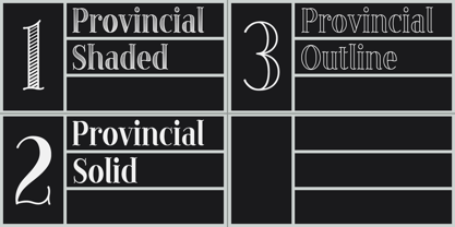
3
estilos y opciones de paquetes familiares.
Más información sobre esta familia
- Aa Glifos
-
¡Mejor PrecioPaquetes de familia
- Estilos individuales
- Especificaciones técnicas
- Licencias
Por Estilo:
$4.00 USD
Paquete de 5 estilos:
$20.00 USD
Sobre la familia Provincial Fuente
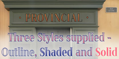
PROVINCIAL is a relaxed, flowing, wavy serif, unsophisticated with a slightly hand drawn feel, yet elegant enough for formal uses. The three font family comprises Outline, Shaded and Solid, with matching spacing and kerning, so can be overlaid to create bicolor and multicolor typography.
Diseñadores: Keith Bates
Editorial: K-Type
Fundición: K-Type
Propietario del diseño: K-Type
MyFonts debut: Mar 20, 2014
Provincial

Acerca de K-Type
K-Type is a small, independent type foundry based in Manchester England, offering a unique range of high quality fonts which are modestly and simply priced for designers, small businesses and large organisations.In addition to creating new typefaces resulting from formal experimentation, many K-Type fonts show the influence of inspirational artists and designers, many exploring the mix of insular and eclectic that has forged the typographical landscape of Britain and America.K-Type is also keen to make affordable fonts from styles which possess cultural currency or an existing social presence, generally redrawn to include comprehensive character sets containing a full complement of Latin Extended-A glyphs. New, previously unavailable weights and italics are often designed and added.
Seguir leyendo
Leer menos
- Al seleccionar una opción, se actualiza toda la página.