


Ir directamente al contenido
Ir al contenido principal

Spitzkant

por Fincker Font Cuisine
Estilos individuales desde $29.00 USD
Familia completa de 20 fuentes: $185.00 USD
La familia tipográfica Spitzkant fue diseñada por Julien Fincker y publicada por Fincker Font Cuisine. Spitzkant contiene 20 estilos y opciones de paquete familiar. Más información sobre esta familia

Sobre la familia


About the design

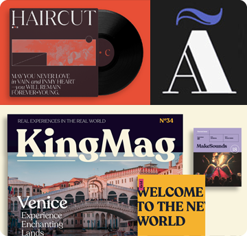
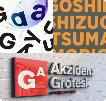
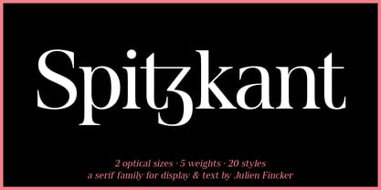
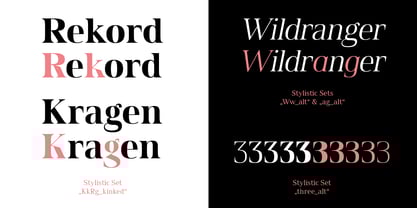
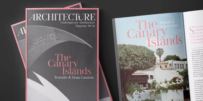
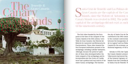
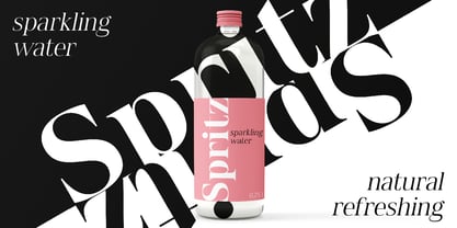
Spitzkant is a serif typeface family that is characterized by strong contrasts. Pointed, sharp serifs and edges contrast with round and fine forms, making it very individual and expressive. This makes it particularly suitable for branding, editorial, packaging and advertising. The high-contrast display version has been complemented by a lower-contrast text version, making Spitzkant in combination suitable for both strong headlines and extensive body text. An allrounder that can be used for many purposes.


Features

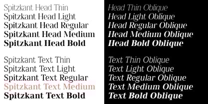
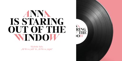
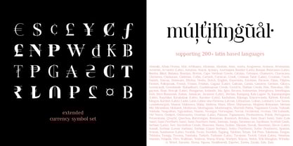
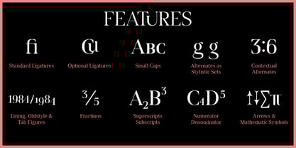
The Spitzkant Head and Text family has a total of 2 optical sizes, 5 weights and 20 styles, from thin to bold and matching italics. With over 850 characters, it covers over 200 Latin-based languages. It also has an extended set of currency symbols and a whole range of open type features. For example, there are alternative characters as Stylistic Sets, Small Caps, automatic fractions and many other features.


Ligatures

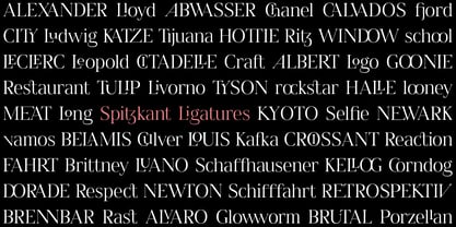
Especially the extensive selection of ligatures (standard and optional) is a special feature which was an important part during the design process. With over 95 different ligatures there are many possibilities to give headlines and logos an individual touch.


Get the Variable Font here: https://www.myfonts.com/fonts/julien-fincker/spitzkant-variable/

Diseñadores: Julien Fincker

Fundición actual: Fincker Font Cuisine

MyFonts debut: May 26, 2020

Spitzkant

Acerca de Fincker Font Cuisine

At Fincker Font Cuisine, we are passionate about letters, type, and everything that comes with them. We take pride in offering a diverse range of retail typefaces and custom solutions tailored to meet the unique needs of our clients. With our French roots, we appreciate the art of fine dining and draw many parallels between cooking and font design. Just as in culinary preparation, it is the attention to detail that makes all the difference in our creations – therefore our name, Font Cuisine. https://www.fontcuisine.com/

Seguir leyendo

Leer menos