


Seleccione este tipo de licencia cuando esté desarrollando una aplicación app para iOS, Android o Windows Phone, y vaya a incrustar el archivo en el código de su aplicación móvil. va a incrustar el archivo fuente en el código de su aplicación móvil.
Toppler
por K-Type
Estilos individuales desde $20.00 USD
Familia completa de 4 fuentes: $20.00 USD

Toppler Fuente La familia era
diseñada por
Keith Bates y
publicado por
K-Type. Toppler contiene
4
estilos y opciones de paquetes familiares.
Más información sobre esta familia
- Aa Glifos
-
¡Mejor PrecioPaquetes de familia
- Estilos individuales
- Especificaciones técnicas
- Licencias
Por Estilo:
$5.00 USD
Paquete de 4 estilos:
$20.00 USD
Sobre la familia Toppler Fuente
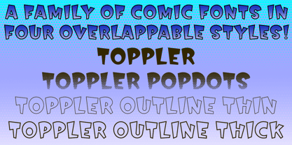
TOPPLER is a top-heavy comic font, K-Type’s salute to nineties freebies such as Ben Balvanz’s Baby Kruffy, Comix Heavy from WSI, and Dave Bastian’s Startling. Unlike those glorious fonts-of-old, Toppler contains a complete repertoire of symbols, dingbats and Latin Extended-A accented characters, as well as a proper lowercase, careful spacing and tasty kerning. Toppler also boasts cleaner outlines and more refined shapes.
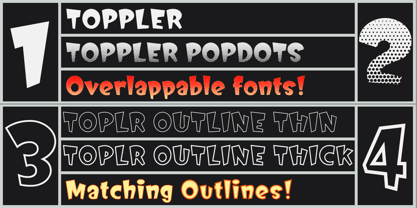
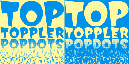
The Toppler family comprises four fonts that share spacing and kerning, so can be overlapped to produce bicolor and multicolor effects. In addition to the regular, solid style of Toppler, there is a shaded ‘Popdots’ style, plus thick and thin outline fonts.
Diseñadores: Keith Bates
Editorial: K-Type
Fundición: K-Type
Propietario del diseño: K-Type
MyFonts debut: Nov 14, 2018
Toppler

Acerca de K-Type
K-Type is a small, independent type foundry based in Manchester England, offering a unique range of high quality fonts which are modestly and simply priced for designers, small businesses and large organisations.In addition to creating new typefaces resulting from formal experimentation, many K-Type fonts show the influence of inspirational artists and designers, many exploring the mix of insular and eclectic that has forged the typographical landscape of Britain and America.K-Type is also keen to make affordable fonts from styles which possess cultural currency or an existing social presence, generally redrawn to include comprehensive character sets containing a full complement of Latin Extended-A glyphs. New, previously unavailable weights and italics are often designed and added.
Seguir leyendo
Leer menos
- Al seleccionar una opción, se actualiza toda la página.