


Seleccione este tipo de licencia cuando esté desarrollando una aplicación app para iOS, Android o Windows Phone, y vaya a incrustar el archivo en el código de su aplicación móvil. va a incrustar el archivo fuente en el código de su aplicación móvil.
Tuna
por Ligature Inc
Estilos individuales desde $0.00 USD
Familia completa de 11 fuentes: $249.00 USD

Tuna Fuente La familia era
diseñada por
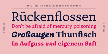
Felix Braden,
Alex Rütten y
publicado por
Ligature Inc. Tuna contiene
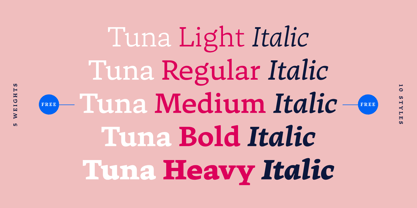
10
estilos y opciones de paquetes familiares.
Más información sobre esta familia
- Aa Glifos
-
¡Mejor PrecioPaquetes de familia
- Estilos individuales
- Especificaciones técnicas
- Licencias
Sobre la familia Tuna Fuente
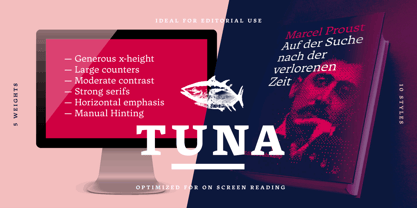
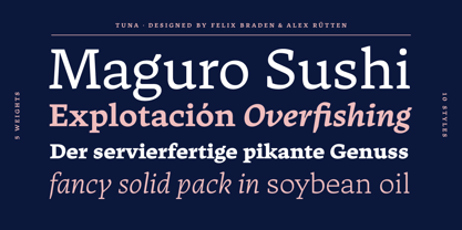
Tuna is simply a contemporary body text font. It is contemporary, meaning the merge of charming broad-nibbed calligraphic style with optimized readability on screen – showing that the roots of writing and typesetting are still in charge when reading “Anna Karenina” on your Kindle till 4 o’clock in the morning.
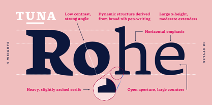
Tuna has a natural fit for cross-media use because the design is based on forms characterized by different conditions of constancy, stability and good readability. Well-defined shapes and distinctive details only become apparent when used in larger sizes, making Tuna a true all-rounder.
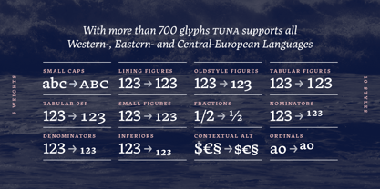
With more than 700 glyphs in 10 styles created with a maximum of consideration, it has all the qualities of a modern OpenType font serving the needs of today's communication.
If you would like to read more about the Typeface please visit our promo site.
Diseñadores: Felix Braden, Alex Rütten
Editorial: Ligature Inc
Fundición: Ligature Inc
Propietario del diseño: Ligature Inc
MyFonts debut: Jan 17, 2017
Tuna
Acerca de Ligature Inc
Ligature Inc. is the foundry of Alexander Rütten and Felix Braden (Floodfonts). Alexander and Felix met while studying communication design at the Trier University of Applied Sciences. After graduating they worked as editorial- and interface designers, art directors and developers for interactive applications. Both designed several award-winning typefaces for well-known foundries such as FontShop International, Linotype and URW+ before they found out that font- collaboration is a lot of fun! Now they work on fonts using a digital ping-pong-like process bridging the distance between Berlin and Cologne, happy to transform the solitary type design process into a close dialog about screen optimization, readability and the development of a distinct headline-character.
Seguir leyendo
Leer menos
- Al seleccionar una opción, se actualiza toda la página.