


Seleccione este tipo de licencia cuando esté desarrollando una aplicación app para iOS, Android o Windows Phone, y vaya a incrustar el archivo en el código de su aplicación móvil. va a incrustar el archivo fuente en el código de su aplicación móvil.
VLNL Bint™
por VetteLetters
Estilos individuales desde $35.00 USD

VLNL Bint Fuente La familia era
diseñada por
Donald Roos y
publicado por
VetteLetters. VLNL Bint contiene
1
estilos.
Más información sobre esta familia
Sobre la familia VLNL Bint Fuente
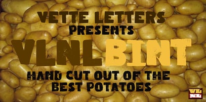
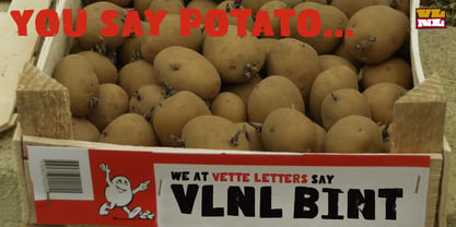
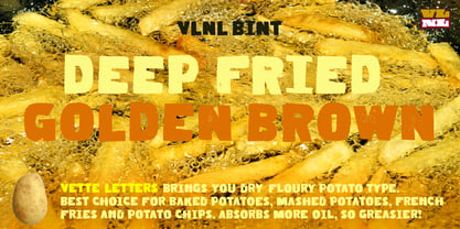
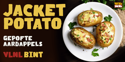
Kornelis de Vries, a headmaster from the Dutch province of Friesland, cultivated new potato breeds that he named after pupils in his school. In the early 1900s he came up with the tasty Bintje (a Frisian girl’s name) and it became a big success – in Belgium and France it has remained the most popular potato for french fries to this day, more than a century since its introduction.
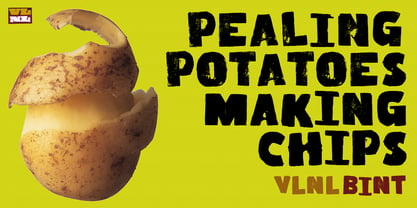
Donald Roos took 10 kilos of fresh Bintje potatoes and cut the Bint typeface by hand with a short, sharp knife. He then inked each character once and printed it twice; the second, lighter printing is accommodated in the lower case alphabet. The Bint family offers a script to make the letters bounce up and down the baseline; with OpenType functionality the font randomly chooses each character from the upper- or lowercase alphabet. ‘Tabular lining figures’ will activate a series of negative numerals in boxes; ‘Discretionary ligatures’ activates specially designed letter combinations like ‘www’ as well as arrows and stars. Bint has a distinct, slightly rough handmade appearance, making it useful for a wide range of designs.
Diseñadores: Donald Roos
Editorial: VetteLetters
Fundición: VetteLetters
Propietario del diseño: VetteLetters
MyFonts debut: Mar 17, 2009
VLNL Bint™
is a trademark of VetteLetters.
Acerca de VetteLetters
VetteLetters.nl is fascinated by kebab shops, local chinese restaurants and fish-and-chips joints – not just the food but especially the shopfront typography. If all the other type foundries are like haute cuisine restaurants, then VetteLetters is the font-imbiss in the world of exclusive and expensive font foundries. VetteLetters, based in Amsterdam, loves food and loves fonts. So let’s introduce our chefs: After a wonderful career as a dishwasher, assistant cook, some kind of designer, and last but not least type designer, Donald® Roos is now one of VetteLetters CEOs. Donald DBXL Beekman is “the other Donald” and also the other CEO. DBXL produces as many typefases as Prince makes records. Jacques “Sardines” Le Bailly also known as the Baron von Fonthausen is Chief Type Tech. Dev. Dept. and we have Martin “TwoPoints” Lorenz, baking his fonts in the lovely climate of Barcelona. The latest addition to the VetteLetters stable is designer Henning Brehm aka “Design Tourist” hailing from Berlin.
Seguir leyendo
Leer menos
- Al seleccionar una opción, se actualiza toda la página.