


Seleccione este tipo de licencia cuando esté desarrollando una aplicación app para iOS, Android o Windows Phone, y vaya a incrustar el archivo en el código de su aplicación móvil. va a incrustar el archivo fuente en el código de su aplicación móvil.
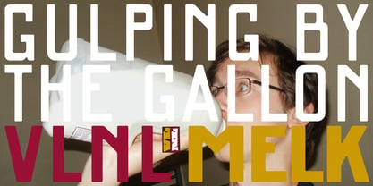
VLNL Melk™
por VetteLetters
Estilos individuales desde $29.99 USD

VLNL Melk Fuente La familia era
diseñada por
publicado por
VetteLetters. VLNL Melk contiene
3
estilos.
Más información sobre esta familia
Sobre la familia VLNL Melk Fuente
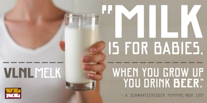
At VetteLetters we like food but we also appreciate our drinks. Yes, of the non-alcoholic kind as well. Like milk. Contrary to what Arnold Schwartzenegger once said, Milk is not just for babies. It contains a whole lot of stuff that is genuinely good for you. Like proteins, carbohydrates, minerals (calcium a.o.) and many vitamins.
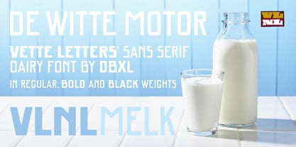
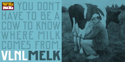
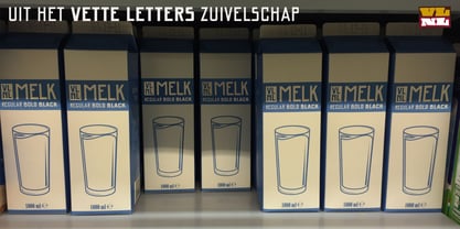
One time visiting The Hague, Donald DBXL spotted a tile tableau on a brick wall, advertising a dairy factory called ‘De Sierkan’. Yellow sans serif letters on a bright blue background, dating back to the late 19th century, immediately grabbed DBXL’s attention. Especially because the tableau showed both regular and bold letters with some lovely peculiarities here and there. De Sierkan appeared to have been a milk factory solely operating in The Hague from 1879 until 1961. A number of these wall adverts are still to be seen in The Hague streets today. Photos were taken for later reference. Later is now, the lettering has been digitized, missing characters added, and VLNL Melk sees the light of day.
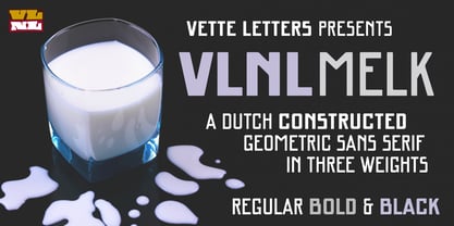
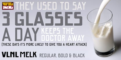
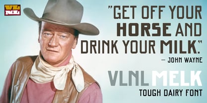
VLNL Melk is an all-caps geometric display sans serif family of three weights, Regular, Bold and Black. The basic shape of the letters is a rectangle with rounded corners, leaving a sturdy no-nonsense look and feel. It has a distinct historic aura, but with both feet in this digital day and age. It can equally well be used for the logo of a hipster coffee place, as the cover of a historic novel. Actually, VLNL Melk kan be applied in a wide range of designs like logos, posters, flyers, book covers and magazine headlines.
Diseñadores:
Editorial: VetteLetters
Fundición: VetteLetters
Propietario del diseño: VetteLetters
MyFonts debut: Dec 23, 2016
VLNL Melk™
is a trademark of VetteLetters.
Acerca de VetteLetters
VetteLetters.nl is fascinated by kebab shops, local chinese restaurants and fish-and-chips joints – not just the food but especially the shopfront typography. If all the other type foundries are like haute cuisine restaurants, then VetteLetters is the font-imbiss in the world of exclusive and expensive font foundries. VetteLetters, based in Amsterdam, loves food and loves fonts. So let’s introduce our chefs: After a wonderful career as a dishwasher, assistant cook, some kind of designer, and last but not least type designer, Donald® Roos is now one of VetteLetters CEOs. Donald DBXL Beekman is “the other Donald” and also the other CEO. DBXL produces as many typefases as Prince makes records. Jacques “Sardines” Le Bailly also known as the Baron von Fonthausen is Chief Type Tech. Dev. Dept. and we have Martin “TwoPoints” Lorenz, baking his fonts in the lovely climate of Barcelona. The latest addition to the VetteLetters stable is designer Henning Brehm aka “Design Tourist” hailing from Berlin.
Seguir leyendo
Leer menos
- Al seleccionar una opción, se actualiza toda la página.