


Seleccione este tipo de licencia cuando esté desarrollando una aplicación app para iOS, Android o Windows Phone, y vaya a incrustar el archivo en el código de su aplicación móvil. va a incrustar el archivo fuente en el código de su aplicación móvil.
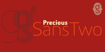
Precious Sans Two
por G-Type
Estilos individuales desde $60.00 USD
Familia completa de 12 fuentes: $60.00 USD

Precious Sans Two Fuente La familia era
diseñada por
Nick Cooke y
publicado por
G-Type. Precious Sans Two contiene
12
estilos y opciones de paquetes familiares.
Más información sobre esta familia
- Aa Glifos
-
¡Mejor PrecioPaquetes de familia
- Estilos individuales
- Especificaciones técnicas
- Licencias
Sobre la familia Precious Sans Two Fuente
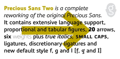
Precious Sans Two is a complete reworking of the 2002 design which was only ever available in PostScript format. Over a decade later G-Type’s Nick Cooke decided to re-appraise the typeface, scrutinise the old letterforms and overhaul the family.
Make no mistake though, Precious Sans Two is no rudimentary re-release; nearly every character has been redrawn, re-proportioned, respaced and improved.
Precious Sans Two is now in cross-platform compatible OpenType format with extended Latin language support for Western & Central Europe, the Baltics & Turkey.
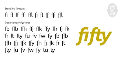
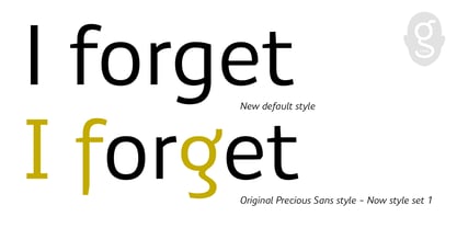
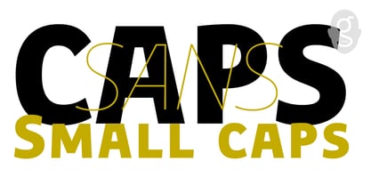
The original quirkier glyphs (f, g, I) have been retained as an OT style set feature and the typeface now contains small caps and an extensive set of discretionary ligatures as well as both proportional & tabular figures.
The character set is further enhanced with the addition of 20 directional single and double arrows in each of the six weights which range from Thin through to Black, all with accompanying italics.
Precious Sans Two is a distinctively modern typeface, well equipped for advanced typographic use in print, web and digital publishing environments.
Diseñadores: Nick Cooke
Editorial: G-Type
Fundición: G-Type
Propietario del diseño: G-Type
MyFonts debut: Aug 16, 2014
Precious Sans Two

Acerca de G-Type
G-Type is a digital font foundry and experienced type design studio founded by Nick Cooke in 1999. G-Type excels at designing logos and custom fonts for leading brands and organisations around the world. Companies and publications as diverse as Vauxhall, Sun Life Financial, Walmart and The Mail On Sunday have had well received typographic makeovers courtesy of G-Type and many more, including NBC Television, SKF, and TATA Consulting use G-Type commercial fonts as the cornerstone of their corporate brand styling.Cooke’s Chevin typeface brands the Royal Mail with distinction and is highly visible at every Post Office throughout the UK. The G-Type retail library is a wonderfully varied and versatile collection of high quality original fonts, invariably containing feature-rich ‘Pro’ character sets brimming with alternates, ligatures, multiple figure options and extensive language coverage. Popular fonts like Houschka Pro, Chevin, Rollerscript and Olicana offer expansive glyph palettes and multiple stylistic sets, enabling your work to adopt various personas without the need to change fonts.
Seguir leyendo
Leer menos
- Al seleccionar una opción, se actualiza toda la página.