


Seleccione este tipo de licencia cuando esté desarrollando una aplicación app para iOS, Android o Windows Phone, y vaya a incrustar el archivo en el código de su aplicación móvil. va a incrustar el archivo fuente en el código de su aplicación móvil.
1610 Cancellaresca
por GLC
Estilos individuales desde $38.00 USD

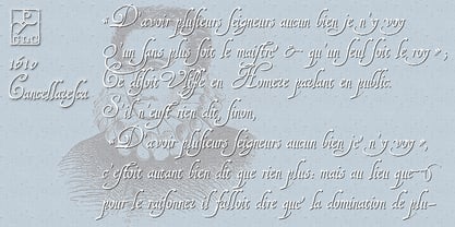
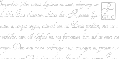
1610 Cancellaresca Fuente La familia era
diseñada por
publicado por
GLC. 1610 Cancellaresca contiene
1
estilos.
Más información sobre esta familia
Sobre la familia 1610 Cancellaresca Fuente
This font was inspired by the “Cancellaresca moderna ” type, which was calligraphed by Francesco Periccioli (published in 1610 in Siena, Italy). It was entirely handwritten by the designer for each circumstance, using quill pen and medieval ink on a rough paper, with added characters as accented ones and a lot of ligatures with respect for the original design.
This font includes “long s” and also a lot of ligatures as “ff”, “ffi” “fij” “pp”...
It can be used for web-site titles, posters and flier designs, editing ancient texts or greeting cards, or as a very decorative and elegant font.
This font retains its qualities and beauty over a wide range of sizes.
1610 Cancellaresca

Acerca de GLC
Gilles Le Corre was born in 1950 in Nantes, France. Painter since the end of 70s, he is also an engraver and calligrapher. He has been learning about medieval art and old books for as long as he can remember. More recently he has made the computer a tool for writing like the quill pen and ink. With it, he aims to make it possible to print books that look just like old ones! Beginning in 2007 he has been trying to reproduce, very exactly, a wide range of historic European typefaces, mainly from medieval and early periods of printing - his favorite period - from 1456 with Gutenberg, up to 1913 with a font inspired by a real old typewriter.
Seguir leyendo
Leer menos
- Al seleccionar una opción, se actualiza toda la página.