Acerca de HiH
HiH stands for Hand-in-Hand because I couldn’t do it alone — any of it. I am as interested in history as I am in typefaces and I firmly believe that no typeface is an island, either. By that I mean, every typeface has a context and a history and is a product of some person(s) creativity and effort. Since alphabets have the purpose of written communication, a typeface cannot be TOTALLY original or it would be useless. A typeface must, at minimum, resemble other typefaces that already exist. If a reader c...
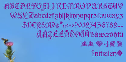
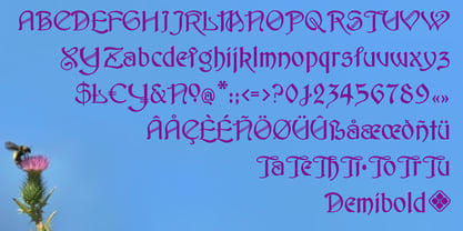
Character Sets
We use a standard Windows 3.1 character set with 213 visible characters or glyphs and 256 total character slots (some reserved for program functions and not visible) for display typefaces. We think Unicode is really great for text faces, but often overkill for display purposes. We use Fontographer 4.1 and like to see the entire character set displayed on a single screen — not possible with Unicode.
We frequently deviate from the standard ASCII set, which we believe includes some silly choices. Don’t look for a “logical not” in our faces. For diacritical marks (accents), we generally include the acute (´), grave (`), dieresis or umlaut (¨), circumflex (ˆ), tilde (˜), cedilla (¸) and macron (¯). Most of our fonts are revivals. Priority is given to the accents and special characters needed to set the native language of the original designer. Bringhurst lists 59 letter forms in Roman- or Latin-based alphabets alone (exclusive of Cyrillic, Greek, Hebrew, etc). For example, there are four Os: the standard O, the slashed O, the horned O, and the open O. When you add in the various accent combinations, from O-acute for to open-O-ogonek, you wind up with a total of forty variations on the letter O alone. The old saw that you cannot be all things to all people obviously applies here.
Note: for the Austro-Hungarian Monarchy, the official administrative languages were German and Hungarian. While Czech, Polish, Serbo-Croatian, Slovenian were important regionally, it was a major political issue that they did not have official standing. (There were periods when their use was actually forbidden.)
We try to include ligatures and alternate characters that were part of the original design. We will also include special characters or dingbats when we deem it appropriate to do so. There is a wealth of printer’s ornaments to be found in specimen books. Many have already been digitized in raster form by Dover and others and are available in inexpensive collections on CD.
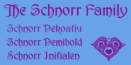
Decorative Initials
As a rule I try to match decorative initials with appropriate small caps, if available, or with a matching or harmonious lowercase. While the lowercase or small caps will be supplied with accents, the decorative initials will not be, with the sometime exception of C-cedilla and the N-tilde. According to
The Chicago Manual of Style, French, Portuguese and Spanish may be set without accents on capitalized vowels; and German can set by using Ae, Oe & Ue in place of the umlauted capitals. Italian varies: accents required for display headlines, but not for text. Æ and Œ will generally not be included in decorated form unless part of the original design.
Selected Bibliography
The books listed below are the ones to which we most frequently refer. Each of these books has something unique to offer. Together they can form the core of a useful typographic library. No specimen books are listed because the most important are far beyond anything most people can afford, running into the thousands of dollars. It is hoped that the holders of major historical libraries, such as Columbia University in NYC and St. Bride’s in London, will gradually digitize the most significant and post them on their web sites. Donations might encourage them — it would be an expensive and time-consuming process.
- Annenberg, TYPE FOUNDRIES OF AMERICA AND THEIR CATALOGS (Oak Knoll Press, New Castle, Deleware, 1994) ISBN 1-884718-06-X. The purpose of this book, and those like it, is to capture history metal type before it is too late. These are labors of love and we are indebted to those who made effort because this history belongs to all of us.
- Bain & Shaw, BLACKLETTER: TYPE AND NATIONAL IDENTITY. (Princeton Architectural Press, NYC 1998) ISBN 1-56898-125-2. Useful contribution to understanding the zeitgeist of blackletter, countering the many unproductive negative comments made by readers familiar only with roman letterforms. Fraktur, especially, can be difficult when you are not used to it, but it does work better with German than English. Now check out Burmese. Chapter on what editors term “German Hybrid Typefaces”: Behrens, Eckmann, Künstler, etc.
- Bringhurst, THE ELEMENTS OF TYPOGRAPHIC STYLE (Hartley & Marks, Vancouver [near where author lives] 2004. ISBN 0-88179-206-3 (pbk). Incomparable must-have book on disciplined page layout and typography with a strong historical perspective. Bringhurst is a major critic of parochial typography.
- Gray, NINETEENTH CENTURY ORNAMENTED TYPEFACES (University of California Press, Berkeley & LA 1976) ISBN 0-520-03074-5 Out of print. Find it used and buy it. Est $40. Originally published by Oxford University Press in 1938.
- Jasper, Berry & Johnson, ENCYCLOPAEDIA OF TYPEFACES, 4th Edition (Cassell & Co., London 2001); ISBN 1-84188-139-2 (pbk). Note: earlier editions are also worth acquiring on used book market.
- Lewis, TYPOGRAPHY DESIGN AND PRACTICE (Taplinger Publishing, NYC 1978) ISBN 0-8008-7922-8 (pbk). Useful discussion on artistic developments as they impacted display typography from 1800. Draws insightful connection between blackletter faces and sans-serifs.
- McGrew, AMERICAN METAL TYPEFACES OF THE TWENTIETH CENTURY, 2nd Edition (Oak Knoll Books, New Castle, Delaware 1993); ISBN 0938768-39-5 (pbk). Includes typefaces from 19th century that continued to be cast in the 20th century, like Pekin.
- Petzendorfer, TREASURY OF AUTHENTIC ART NOUVEAU ALPHABETS, DECORATIVE INITIALS, MONOGRAMS, FRAMES AND ORNAMENTS (Dover Publications, New York 1984); originally published by Julius Hoffmann of Stuttgart in 1903 under the title SCHRIFTENATLAS NEUE FOLGE: EINE SAMMLUNG VON ALPHABETEN INITIALEN UND MONOGRAMMEN ZUSAMMENGESTELLT VON HOFRAT L. PETZENDORFER. ISBN 0-486-24653-1 (pbk).
- Solo, THE SOLOTYPE CATALOG OF 4,147 DISPLAY TYPEFACES (Dover Publications, New York 1992) ISBN 0-486-27169-2 (pbk). As title indicates, book was intended as a commercial catalog and not a historical record. Because of practice of renaming typefaces to support that purpose and the lack of any further information on where the typefaces were collected, the book is less useful than it might have been. It would be wonderful if an accompanying database was compiled. Many faces simply can't be found elsewhere.
- The University of Chicago Press, THE CHICAGO MANUAL OF STYLE, 14th Edition (The University of Chicago Press, Chicago & London 1993) ISBN 0-226-10389-7. Fifteenth edition is now available. Probably the best reference source for the practical details of applied typography.
Seguir leyendo
Leer menos