


Sélectionnez ce type de licence lorsque vous développez une application pour iOS, Android ou Windows Phone et que vous intégrez le fichier de fonte dans le code de votre application mobile.
1522 Vicentino
par GLC
Styles individuels à partir de $60.00 USD

1522 Vicentino Font la famille était
conçu par
publié par
GLC. 1522 Vicentino contient
1
styles.
En savoir plus sur cette famille
À propos de la famille 1522 Vicentino Police
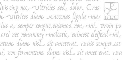
This font is mainly inspired from the engraved characters of the small book known as “Operina”, or “The method and rules for writing cursive letters or chancery script” from the famous calligrapher Ludovico Vicentino Arrighi, published in Roma in 1522 and signed with simplicity “Ludovico Vicentino”.
The font contains a large set of standard ligatures and alternative characters: two lower cases, four sets of standard capitals, long s and variants, titlings, each feature easy to use with OTF managing software.
It is a pro font, containing Baltic, Eastern, Central, Western European and Turkish diacritics.
1522 Vicentino

À propos GLC
Gilles Le Corre was born in 1950 in Nantes, France. Painter since the end of 70s, he is also an engraver and calligrapher. He has been learning about medieval art and old books for as long as he can remember. More recently he has made the computer a tool for writing like the quill pen and ink. With it, he aims to make it possible to print books that look just like old ones! Beginning in 2007 he has been trying to reproduce, very exactly, a wide range of historic European typefaces, mainly from medieval and early periods of printing - his favorite period - from 1456 with Gutenberg, up to 1913 with a font inspired by a real old typewriter.
En savoir plus
Lire moins
- Le choix d'une sélection entraîne l'actualisation de la page entière.