


Sélectionnez ce type de licence lorsque vous développez une application pour iOS, Android ou Windows Phone et que vous intégrez le fichier de fonte dans le code de votre application mobile.
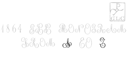
1864 GLC Monogram
par GLC
Styles individuels à partir de $10.00 USD
Famille complète de 14 polices: $80.00 USD

1864 GLC Monogram Font la famille était
conçu par
publié par
GLC. 1864 GLC Monogram contient
14
styles et des offres familiales.
En savoir plus sur cette famille
- Aa Glyphs
-
Meilleure offreOffres familiales
- Styles individuels
- Spécifications techniques
- Licences
À propos de la famille 1864 GLC Monogram Police
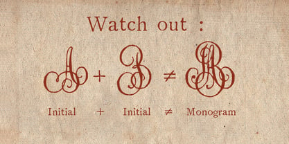
This family of two character monograms and initial letters was inspired from a French portfolio containing about two hundred examples of "Chiffres - deux lettres", destinated to engravers and jewelers, published in Paris in 1864, drawn by French engraver, C. Demengeot.
Unfortunately, a large part of the pages were lost, so we have had to redraw about two thirds of the complete monogram family.
Each package contains numerals and two complete sets of two-letter monograms, for example the A-B set, containing AA AB AC... corresponding to caps keys alphabet and BA, BB, BC... corresponding to lower case keys alphabet.
We have added an Initial set, with two choices of single characters.
Warning: I and J have strictly identical monograms.
1864 GLC Monogram

À propos GLC
Gilles Le Corre was born in 1950 in Nantes, France. Painter since the end of 70s, he is also an engraver and calligrapher. He has been learning about medieval art and old books for as long as he can remember. More recently he has made the computer a tool for writing like the quill pen and ink. With it, he aims to make it possible to print books that look just like old ones! Beginning in 2007 he has been trying to reproduce, very exactly, a wide range of historic European typefaces, mainly from medieval and early periods of printing - his favorite period - from 1456 with Gutenberg, up to 1913 with a font inspired by a real old typewriter.
En savoir plus
Lire moins
- Le choix d'une sélection entraîne l'actualisation de la page entière.