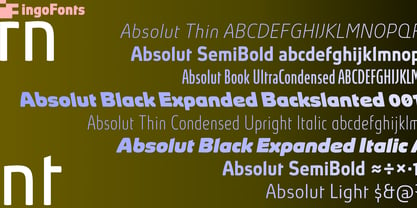
Absolut Pro Thin Backslanted Italic
Absolut Pro Thin Extra Italic
Absolut Pro Thin Upright Italic
Absolut Pro Light Backslanted Italic
Absolut Pro Light Extra Italic
Absolut Pro Light Upright Italic
Absolut Pro Book Backslanted Italic
Absolut Pro Book Extra Italic
Absolut Pro Book Upright Italic
Absolut Pro Medium Backslanted Italic
Absolut Pro Medium Extra Italic
Absolut Pro Medium Upright Italic
Absolut Pro Bold Backslanted Italic
Absolut Pro Bold Extra Italic
Absolut Pro Bold Upright Italic
Absolut Pro Black Backslanted Italic
Absolut Pro Black Extra Italic
Absolut Pro Black Upright Italic
Absolut Pro Thin Condensed Italic
Absolut Pro Thin Condensed Extra Italic
Absolut Pro Thin Condensed Backslanted Italic
Absolut Pro Thin Condensed Upright Italic
Absolut Pro Light Condensed Italic
Absolut Pro Light Condensed Backslanted Italic
Absolut Pro Light Condensed Extra Italic
Absolut Pro Light Condensed Upright Italic
Absolut Pro Book Condensed Italic
Absolut Pro Book Condensed Backslanted Italic
Absolut Pro Book Condensed Extra Italic
Absolut Pro Book Condensed Upright Italic
Absolut Pro Medium Condensed Italic
Absolut Pro Medium Condensed Backslanted Italic
Absolut Pro Medium Condensed Extra Italic
Absolut Pro Medium Condensed Upright Italic
Absolut Pro Bold Condensed Italic
Absolut Pro Bold Condensed Backslanted Italic
Absolut Pro Bold Condensed Extra Italic
Absolut Pro Bold Condensed Upright Italic
Absolut Pro Thin Ultra Condensed Italic
Absolut Pro Thin Ultra Condensed Backsl Italic
Absolut Pro Thin Ultra Condensed Extra Italic
Absolut Pro Thin Ultra Condensed Upright Italic
Absolut Pro Light Ultra Condensed Italic
Absolut Pro Light Ultra Condensed Backsl Italic
Absolut Pro Light Ultra Condensed Extra Italic
Absolut Pro Light Ultra Condensed Upright Italic
Absolut Pro Book Ultra Condensed Italic
Absolut Pro Book Ultra Condensed Backsl Italic
Absolut Pro Book Ultra Condensed Extra Italic
Absolut Pro Book Ultra Condensed Upright Italic
Absolut Pro Medium Ultra Condensed Italic
Absolut Pro Medium Ultra Condensed Backsl Italic
Absolut Pro Medium Ultra Condensed Extra Italic
Absolut Pro Medium Ultra Condensed Upright Italic
Absolut Pro Bold Ultra Condensed Italic
Absolut Pro Bold Ultra Condensed Backsl Italic
Absolut Pro Bold Ultra Condensed Extra Italic
Absolut Pro Bold Ultra Condensed Upright Italic
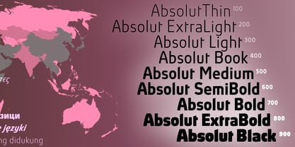
Absolut Pro Extra Light
Absolut Pro Extra Light Italic
Absolut Pro Extra Light Backslt Italic
Absolut Pro Extra Light Extra Italic
Absolut Pro Extra Light Upright Italic
Absolut Pro Semi Bold
Absolut Pro Semi Bold Italic
Absolut Pro Semi Bold Backslt Italic
Absolut Pro Semi Bold Extra Italic
Absolut Pro Semi Bold Upright Italic
Absolut Pro Extra Bold
Absolut Pro Extra Bold Italic
Absolut Pro Extra Bold Backslt Italic
Absolut Pro Extra Bold Extra Italic
Absolut Pro Extra Bold Upright Italic
Absolut Pro Extra Light Condensed
Absolut Pro Extra Light Condensed Italic
Absolut Pro Extra Light Condensed Backslt Italic
Absolut Pro Extra Light Condensed Extra Italic
Absolut Pro Extra Light Condensed Up Italic
Absolut Pro Semi Bold Condensed
Absolut Pro Semi Bold Condensed Italic
Absolut Pro Semi Bold Condensed Backslt Italic
Absolut Pro Semi Bold Condensed Extra Italic
Absolut Pro Semi Bold Condensed Up Italic
Absolut Pro Extra Bold Condensed
Absolut Pro Extra Bold Condensed Italic
Absolut Pro Extra Bold Condensed Backslt Italic
Absolut Pro Extra Bold Condensed Extra Italic
Absolut Pro Extra Bold Condensed Up Italic
Absolut Pro Extra Light Ultra Condensed
Absolut Pro Extra Light Ultra Condensed Italic
Absolut Pro Extra Light UCond Backsl Italic
Absolut Pro Extra Light Ultra Condensed XItalic
Absolut Pro Extra Light Ultra Condensed Up Italic
Absolut Pro Semi Bold Ultra Condensed
Absolut Pro Semi Bold Ultra Condensed Italic
Absolut Pro Semi Bold UCond Backsl Italic
Absolut Pro Semi Bold Ultra Condensed XItalic
Absolut Pro Semi Bold Ultra Condensed Up Italic
Absolut Pro Thin Expanded
Absolut Pro Thin Expanded Italic
Absolut Pro Thin Expanded Backslt Italic
Absolut Pro Thin Expanded Extra Italic
Absolut Pro Thin Expanded Upright Italic
Absolut Pro Extra Light Expanded
Absolut Pro Extra Light Expanded Italic
Absolut Pro Extra Light Exp Backslt Italic
Absolut Pro Extra Light Exp Extra Italic
Absolut Pro Extra Light Exp Upright Italic
Absolut Pro Light Expanded
Absolut Pro Light Expanded Italic
Absolut Pro Light Expanded Backslt Italic
Absolut Pro Light Expanded Extra Italic
Absolut Pro Light Expanded Upright Italic
Absolut Pro Book Expanded
Absolut Pro Book Expanded Italic
Absolut Pro Book Expanded Backslt Italic
Absolut Pro Book Expanded Extra Italic
Absolut Pro Book Expanded Upright Italic
Absolut Pro Medium Expanded
Absolut Pro Medium Expanded Italic
Absolut Pro Medium Exp Backslt Italic
Absolut Pro Medium Exp Extra Italic
Absolut Pro Medium Exp Upright Italic
Absolut Pro Semi Bold Expanded
Absolut Pro Semi Bold Expanded Italic
Absolut Pro Semi Bold Exp Backslt Italic
Absolut Pro Semi Bold Exp Extra Italic
Absolut Pro Semi Bold Exp Upright Italic
Absolut Pro Bold Expanded
Absolut Pro Bold Expanded Italic
Absolut Pro Bold Expanded Backslt Italic
Absolut Pro Bold Expanded Extra Italic
Absolut Pro Bold Expanded Upright Italic
Absolut Pro Extra Bold Expanded
Absolut Pro Extra Bold Expanded Italic
Absolut Pro Extra Bold Exp Backslt Italic
Absolut Pro Extra Bold Exp Extra Italic
Absolut Pro Extra Bold Exp Upright Italic
Absolut Pro Black Expanded
Absolut Pro Black Expanded Italic
Absolut Pro Black Expanded Backslt Italic
Absolut Pro Black Expanded Extra Italic
Absolut Pro Black Expanded Upright Italic
Absolut Pro VF Book
Absolut Pro VF Book Extra Italic
Absolut Pro Thin
Absolut Pro Thin Italic
Absolut Pro Light
Absolut Pro Light Italic
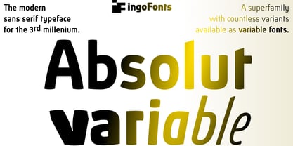
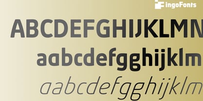
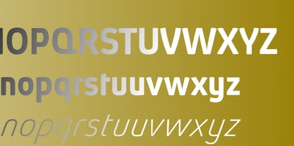
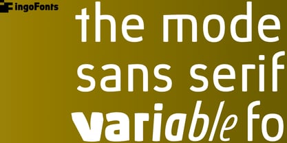
Absolut Pro Book
Absolut Pro Book Italic
Absolut Pro Medium
Absolut Pro Medium Italic
Absolut Pro Bold
Absolut Pro Bold Italic
Absolut Pro Black
Absolut Pro Thin Condensed
Absolut Pro Light Condensed
Absolut Pro Book Condensed
Absolut Pro Medium Condensed
Absolut Pro Bold Condensed
Absolut Pro Thin Ultra Condensed
Absolut Pro Light Ultra Condensed
Absolut Pro Black Italic
Absolut Pro Book Ultra Condensed
Absolut Pro Medium Ultra Condensed
Absolut Pro Bold Ultra Condensed