


Sélectionnez ce type de licence lorsque vous développez une application pour iOS, Android ou Windows Phone et que vous intégrez le fichier de fonte dans le code de votre application mobile.
Aether Rain™
par Fenotype
Styles individuels à partir de $12.00 USD
Famille complète de 7 polices: $20.00 USD


Aether Rain Font la famille était
conçu par
Emil Karl Bertell et
publié par
Fenotype. Aether Rain contient
7
styles et des offres familiales.
En savoir plus sur cette famille
- Aa Glyphs
-
Meilleure offreOffres familiales
- Styles individuels
- Spécifications techniques
- Licences
Basic typesetting
Letter case
Numerals and scientific typesetting
Typographic variants
Réinitialiser
Par style :
$2.85 USD
Paquet de 7 styles:
$20.00 USD
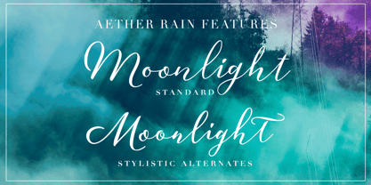
À propos de la famille Aether Rain Police
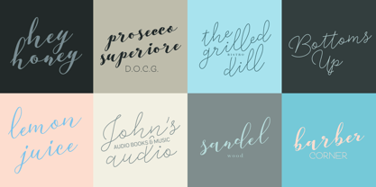
Aether Rain est une famille d'écriture moderne et élégante qui convient aussi bien à un usage décontracté qu'à un usage formel. Aether Rain comprend les alphabets latins de base, les chiffres et la ponctuation. Aether Rain est équipé de Ligatures Standard qui fonctionnent automatiquement et il a également des Alternatives Stylistiques (fonctionnalité OpenType) pour chaque caractère - et les scripts sont également encodés PUA afin que vous puissiez accéder aux caractères également avec Silhouette Studio, Cricut Design Space.
Concepteurs: Emil Karl Bertell
Éditeur: Fenotype
Fonderie: Fenotype
Maître d'ouvrage: Fenotype
MyFonts débout: Nov 28, 2017
Aether Rain™
est une marque déposée de Fenotype Typefaces.
À propos Fenotype
Emil Bertell a tout fait. Ayant publié ses premiers dossiers de police à 16 ans, il était considéré comme un héros international de la police police alors qu'il n'était encore qu'un adolescent. Il a ensuite fréquenté une école de design, a abandonné ses études et est devenu un graphiste et un illustrateur de renom. Aujourd'hui l'un des créateurs de caractères les plus populaires des pays nordiques sur MyFonts, ce Finlandais a déclaré dans l'interview qu'il a accordée à Les créatifs qu'il était "obsédé par la culture visuelle depuis le début". Avant de ...
En savoir plus