Ignorer et passer au contenu
Archer

Archer®

par Hoefler & Co.
Licences à partir de $240.00 USD
Famille complète de 22 polices: $524.00 USD
Archer Font la famille était conçu par Jonathan Hoefler et publié par Hoefler & Co.. Archer contient 44 styles et des offres familiales.

En savoir plus sur cette famille
ESSAI GRATUIT DE 30 JOURS de Monotype Fonts pour obtenir plus de 150 000 polices de plus de 1 400 fonderies de caractères. Démarrer l'essai gratuit
Démarrer l'essai gratuit

Archer Complete Family Pack

22 polices

Meilleure offre!

  • Archer Hairline Archer Hairline

  • Archer Hairline Italic Archer Hairline Italic

  • Archer Thin Archer Thin

  • Archer Thin Italic Archer Thin Italic

  • Archer Extra Light Archer Extra Light

  • Archer Extra Light Italic Archer Extra Light Italic

  • Archer Light Archer Light

  • Archer Light Italic Archer Light Italic

  • Archer Book Archer Book

  • Archer Book Italic Archer Book Italic

  • Archer Medium Archer Medium

  • Archer Medium Italic Archer Medium Italic

  • Archer Semibold Archer Semibold

  • Archer Semibold Italic Archer Semibold Italic

  • Archer Bold Archer Bold

  • Archer Bold Italic Archer Bold Italic

  • Archer Black Archer Black

  • Archer Black Italic Archer Black Italic

  • Archer Extra Black Archer Extra Black

  • Archer Extra Black Italic Archer Extra Black Italic

  • Archer Ultra Archer Ultra

  • Archer Ultra Italic Archer Ultra Italic

Par style :

$23.81 USD

Paquet de 22 styles:

$524.00 USD

Voir 12 plus Voir moins
  • Archer Light Archer Light

  • Archer Light Italic Archer Light Italic

  • Archer Book Archer Book

  • Archer Book Italic Archer Book Italic

  • Archer Medium Archer Medium

  • Archer Medium Italic Archer Medium Italic

  • Archer Semibold Archer Semibold

  • Archer Semibold Italic Archer Semibold Italic

  • Archer Bold Archer Bold

  • Archer Bold Italic Archer Bold Italic

Par style :

$29.30 USD

Paquet de 10 styles:

$293.00 USD

  • Archer Black Archer Black

  • Archer Black Italic Archer Black Italic

  • Archer Extra Black Archer Extra Black

  • Archer Extra Black Italic Archer Extra Black Italic

  • Archer Ultra Archer Ultra

  • Archer Ultra Italic Archer Ultra Italic

Par style :

$40.00 USD

Paquet de 6 styles:

$240.00 USD

  • Archer Hairline Archer Hairline

  • Archer Hairline Italic Archer Hairline Italic

  • Archer Thin Archer Thin

  • Archer Thin Italic Archer Thin Italic

  • Archer Extra Light Archer Extra Light

  • Archer Extra Light Italic Archer Extra Light Italic

Par style :

$40.00 USD

Paquet de 6 styles:

$240.00 USD

À propos de la famille Archer Police


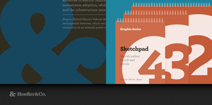
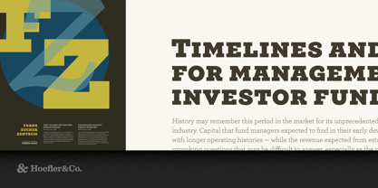
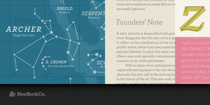
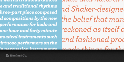
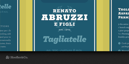
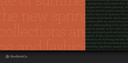
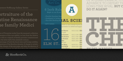
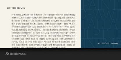
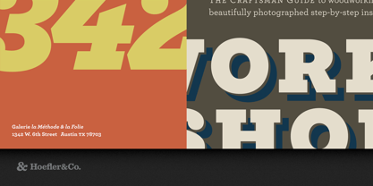
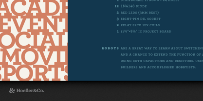
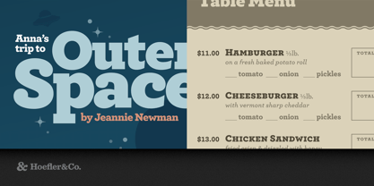
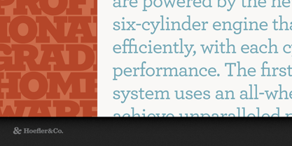
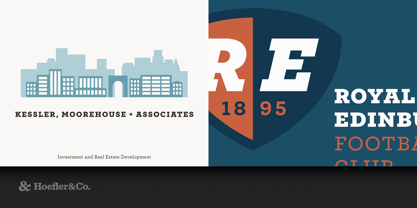
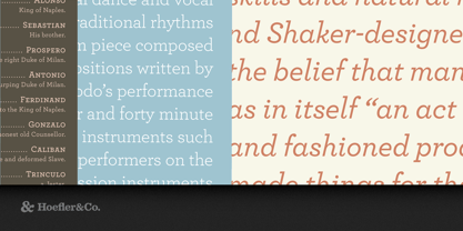
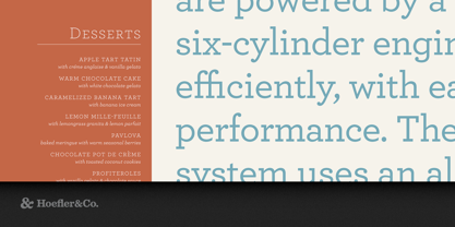
Sweet but not saccharine, earnest but not grave, Archer is designed to hit just the right notes of forthrightness, credibility, and charm.

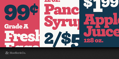
The Archer typeface was designed by Jonathan Hoefler in 2001. While rooted in the ‘geometric slab serif’ style that emerged in the early nineteenth century (and reached full flower a century later), Archer’s many liberties with the style include its uncharacteristic application of ‘ball terminals’ to capital letters such as ‘C’ and ‘S,’ a detail traditionally found only in the lowercase alphabet. Archer was created for Martha Stewart Living, in whose pages the typeface first appeared in 2001.

Slab serifs have been evolving for two hundred years, yet the category continues to be dominated by two basic styles: Antiques and Geometrics. Antiques arise out of the same nineteenth-century tradition that produced the Modern and Scotch styles: at heart, they’re text faces, and they feature all of the qualities needed to thrive at small sizes. (Antiques customarily have the traditional ‘two-storey’ forms of a and g, and a capital R that ends in a flourish.) Our Ziggurat typeface is an example of the Antique style in full flower, capturing the best of what the style has to offer: it’s warm, comforting, and persuasive. But this coziness comes at the expense of modernity, and in the wrong context even the best Antique can feel old-fashioned, musty, and irrelevant.

The Geometric is a twentieth-century riposte to the Antique. Informed by the same kind of rationalist thinking that inspired the great sans serifs of the Bauhaus, Geometrics abandon traditional forms in favor of mathematical strategies. A Geometric’s O is circular rather than elliptical, and its forms shed their residual contrast between thicks and thins. Geometrics usually apply this same rationalism to the woollier parts of the alphabet, replacing the alphabet’s beaks and tails and ball terminals with a program of matching serifs. While these faces can sometimes be bracingly modern, they’re often monotonous, and many Geometrics suffer from an astringent sting that makes them difficult to use and unwelcome to read.

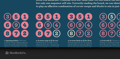
When Martha Stewart Living asked us to develop a new typeface for the magazine, it seemed that a slab serif could answer much of the brief. A slab could be personable, straightforward, and credible, though it would take special effort to also make it pretty, hard-working, and frank. Archer would have to answer some formidable typographic demands, since Living is an almanac of lists, recipes, charts, diagrams, tables, calendars, and glossaries. To make the typeface frank — direct, but not brusque — we introduced subtle cues from the world of typewriter faces, which combine the ordinariness of Antiques with the modern practicality of Geometrics. We restored the vanished ‘ball terminals’ to the lowercase, and uncharacteristically applied these gestures to the capitals as well, in order to yield a font that’s friendly without being silly, and attractive without being flashy. The result is a typeface that’s well-mannered, easy to work with, and inviting to read.


Featured in: Best Fonts for Logos, Best Fonts for Websites, Best Fonts for PowerPoints

Concepteurs: Jonathan Hoefler

Éditeur: Hoefler & Co.

Fonderie: Hoefler & Co.

Maître d'ouvrage: Hoefler & Co.

MyFonts débout: Sep 28, 2021

Archer® is a registered trademark of The Hoefler Type Foundry, Inc.

À propos Hoefler & Co.

Famous for designing long-lived typefaces marked by high performance and high style, Hoefler&Co creates the fonts that give voice to the world’s foremost institutions, publications, causes, and brands. With a library of 1,500 fonts designed for print, web, office, and mobile fonts, Hoefler&Co is everywhere. Their typefaces shaped the presidential campaigns of Barack Obama and Joe Biden; they’re on the cornerstone of One World Trade Center and on every iPhone ever made. They serve brands from Delta Air Lines to Tiffany & Co., publications from Harper’s Bazaar to The New York Times, institutions such as the Guggenheim Museum, The Public Theater, and New York University, and non-profit organizations including the Natural Resources Defense Council, the Southern Poverty Law Center, and The Peconic Land Trust. The Premium foundry page can be viewed Here.

En savoir plus

Lire moins