


Sélectionnez ce type de licence lorsque vous développez une application pour iOS, Android ou Windows Phone et que vous intégrez le fichier de fonte dans le code de votre application mobile.
Averta Standard PE™
par Intelligent Design
Styles individuels à partir de $24.00 USD
Famille complète de 56 polices: $315.00 USD

Averta Standard PE Font la famille était
conçu par
Kostas Bartsokas et
publié par
Intelligent Design. Averta Standard PE contient
56
styles et des offres familiales.
En savoir plus sur cette famille
- Aa Glyphs
-
Meilleure offreOffres familiales
- Styles individuels
- Spécifications techniques
- Licences
Averta Std PE Normal Family
18 policesPar style :
$8.27 USD
Paquet de 18 styles:
$149.00 USD
Averta Std PE Narrow Family
18 policesPar style :
$8.27 USD
Paquet de 18 styles:
$149.00 USD
Averta Std PE Condensed Family
18 policesPar style :
$8.27 USD
Paquet de 18 styles:
$149.00 USD
Averta Standard PE Variable Package
2 policesPar style :
$143.50 USD
Paquet de 2 styles:
$287.00 USD
À propos de la famille Averta Standard PE Police
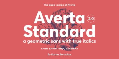
Averta Standard is the basic version of Averta.
If you’ve got something to say, use Averta! Not illuminated with strings of lights, nor decorated in any way, Averta does not mince your words; the name is Greek (αβέρτα) and means to act or to speak openly, bluntly, without hiding. With Averta you will be recognised as direct and clear in a warm, appealing and friendly manner.
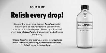
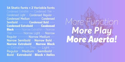
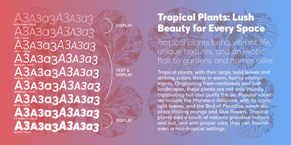
Designed by Kostas Bartsokas to remind us of clear geometric shapes in monolinear strokes, Averta firmly rests in the tradition of constructed grotesques from the first half of the twentieth century in Central Europe. Open apertures and a set of alternate characters such as a two-storey ‘a’ and a double-sloped ‘g’, typically found in Anglo-American gothics, lend the typeface warmth and express an appealing personality. Its portfolio of nine weights from extra-thin to black result in an extremely versatile family.
The five middle-weights of Averta were specifically designed for improved legibility at small sizes. As a sign of true mastery of the geometric genre, this is achieved through careful refinement in those moments were bows transition into stems. On the other hand, the two lightest and the two heaviest weights are improved to assume a confident presence in headlines. What’s more, in contrast to the geometric nature of Averta’s upright styles, no compass and ruler were involved in the design of its corresponding italics, adding a slightly humanist touch and even more versatility to the family.
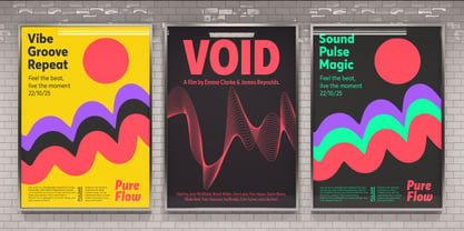
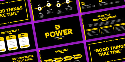
Where would the geometric genre be without shapeshifting full circles into smooth ovals? In order to be prepared for tight headlines or slim columns (and to avoid letterform distortions) the family range of Averta is enriched with optically enhanced Narrow and Condensed widths. To make your life easy, all of the widths and weights are available in one convenient Variable Font file. Equipped with all of these design decisions, Averta is suited for a range of applications from signage systems to visual identities and editorial design details. Needles to say that Averta comes with small caps and a whole range of figure sets, including proportional and tabular sets for old-style and lining figures respectively.
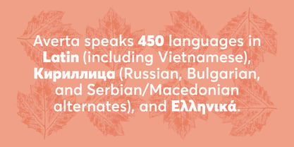
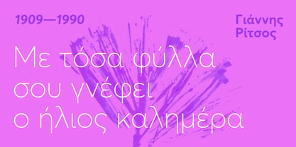
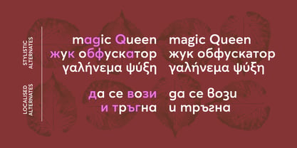
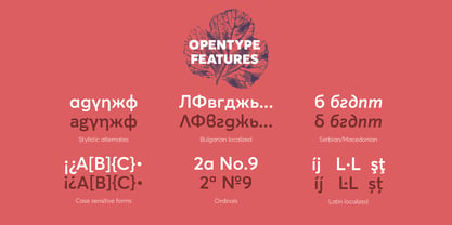
Averta Standard comes with alternate glyphs, case sensitive forms and contextual alternates, in nine weights with matching italics and supports your words in over 400 hundred languages as a multi-script typeface that unites Latin, Greek and Vietnamese alphabets as well as award-winning Cyrillic (3rd at 2017 Granshan Awards) under one roof. Localised letterforms for Bulgarian, Macedonian, Russian and Serbian Cyrillics are included to accommodate your words carefully, but precisely.
Concepteurs: Kostas Bartsokas
Éditeur: Intelligent Design
Fonderie: Intelligent Design
Maître d'ouvrage: Intelligent Design
MyFonts débout: Sep 14, 2015
Averta Standard PE™

À propos Intelligent Design
Kostas Bartsokas is a Greek typeface designer and typographer. During his freelance career he specialised in graphic design, illustration, web design, packaging, and animation; he finally chose to pursue his passion with typography. Kostas holds an MA in Typeface Design from the University of Reading and enjoys innovative explorations in Latin, Greek, Cyrillic, and Arabic type design. He spends his time designing original typefaces, expanding script support of existing ones, and offering consultation for designers and type foundries. He has received numerous awards including a Certificate in Typographic Excellence by TDC, Gold as well as a third place at Granshan, and Award of Excellence and Merit from Communication Arts Typography Annual. He is one proud part of Foundry5.
En savoir plus
Lire moins
- Le choix d'une sélection entraîne l'actualisation de la page entière.