


Sélectionnez ce type de licence lorsque vous développez une application pour iOS, Android ou Windows Phone et que vous intégrez le fichier de fonte dans le code de votre application mobile.
Beaufort®
par Shinntype
Styles individuels à partir de $59.00 USD
Famille complète de 10 polices: $299.00 USD

Beaufort Font la famille était
conçu par
Nick Shinn et
publié par
Shinntype. Beaufort contient
10
styles et des offres familiales.
En savoir plus sur cette famille
- Aa Glyphs
-
Meilleure offreOffres familiales
- Styles individuels
- Spécifications techniques
- Licences
Par style :
$29.90 USD
Paquet de 10 styles:
$299.00 USD
Beaufort Basic
4 policesPar style :
$24.75 USD
Paquet de 4 styles:
$99.00 USD
À propos de la famille Beaufort Police
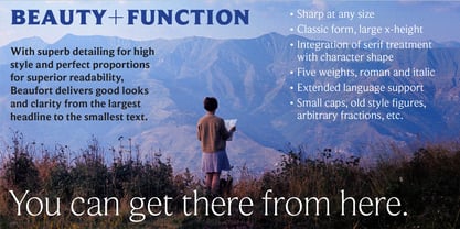
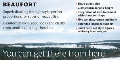
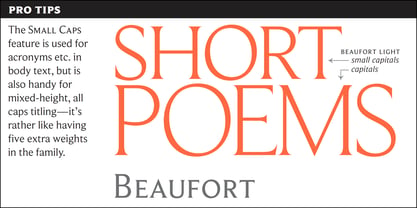
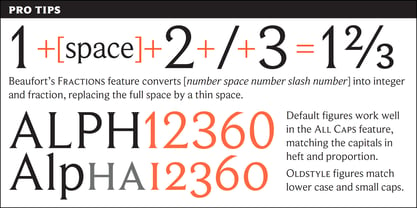
Engaging the issue of scalability, Beaufort® is configured so that serifs render with great sharpness, independent of type size, limited only by device resolution. This scale of effect empowers the typographer with a design axis stretching from awesomely huge to preciously tiny, further enhanced by weights from Light to Heavy, small caps, and alternate figure styles. In style, Beaufort has a number of affinities. In particular, the bold romans recall a kind of “grotesque with small serifs” style popular with sign painters and package lettering artists in the early 20th century, and still going strong. In proportion, the basic Beaufort is in the vein of the classic oldstyle types that descend from
, via the French Oldstyles, or Elzevirs, to
and
in the early twentieth century. Designed for optimum clarity, readibility, and word count, these types have a pronounced angle of stress in the lower case, which is quite large and fairly narrow in relation to the caps. None of the caps are exceptionally narrow, and both cases have an evenness of width that makes for a no-nonsense, orthodox appearance. The strength of the capitals distinguishes these types from those of another “optimizing” era, the 1970s and ’80s, when puny caps made for monotonous text. However, strong though they may be, Beaufort’s caps are not as obtrusive in text as those of Times or Plantin.
Concepteurs: Nick Shinn
Éditeur: Shinntype
Fonderie: Shinntype
Maître d'ouvrage: Shinntype
MyFonts débout: Apr 12, 2002
Beaufort®
is a registered trademark of Shinn Type Foundry Inc., and Shinntype is a registered trademark of Shinn Type Foundry Inc.

À propos Shinntype
These are Nick Shinn’s designs, firmly rooted in the best of the European and North American typographic tradition as it continually evolves. They are solid in text, providing all the bells and whistles of expert typography, and smart in display, with an impeccable attention to detail. Building on his experience as an art director and graphic designer in the 1980s and 90s, and as a pioneer of digital media, Nick launched Shinntype—one of the first online type foundries—in 1998. Shinntype now presents a rich and eclectic catalogue of unique fonts, tailored to contemporary taste.
En savoir plus
Lire moins
- Le choix d'une sélection entraîne l'actualisation de la page entière.