


Sélectionnez ce type de licence lorsque vous développez une application pour iOS, Android ou Windows Phone et que vous intégrez le fichier de fonte dans le code de votre application mobile.
Coinage Caps
par K-Type
Styles individuels à partir de $20.00 USD
Famille complète de 3 polices: $20.00 USD

Coinage Caps Font la famille était
conçu par
Keith Bates et
publié par
K-Type. Coinage Caps contient
3
styles et des offres familiales.
En savoir plus sur cette famille
- Aa Glyphs
-
Meilleure offreOffres familiales
- Styles individuels
- Spécifications techniques
- Licences
Par style :
$6.66 USD
Paquet de 3 styles:
$20.00 USD
À propos de la famille Coinage Caps Police
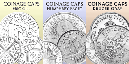
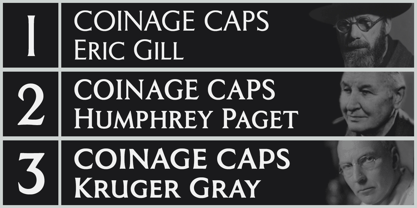
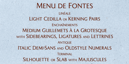
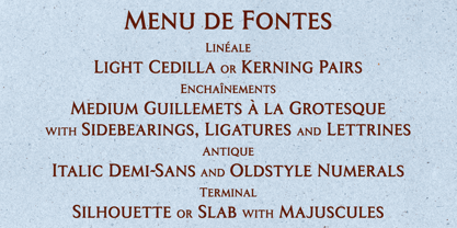
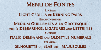
Coinage Caps is a trilogy of small caps fonts based on the Roman lettering used for the designs of British coinage. All three fonts are included in the package.
• Coinage Caps Eric Gill is a regular weight, spur serif style drawn by Eric Gill for silver coin designs in the 1920s which were rejected by the Royal Mint.
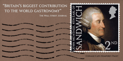
• Coinage Caps Humphrey Paget is a medium weight serif based on the lettering of Thomas Humphrey Paget, designer of the Golden Hind Halfpenny first struck in 1937. This font simulates the soft, slightly rounded corners of the minted letterforms.
• Coinage Caps Kruger Gray is a glyphic, flare serif font typical of the bold style engraved by George Kruger Gray for numerous British and Commonwealth coins during the 1920s and 30s. This font also simulates the slightly rounded corners of the minted letterforms.
Concepteurs: Keith Bates
Éditeur: K-Type
Fonderie: K-Type
Maître d'ouvrage: K-Type
MyFonts débout: Jun 23, 2017
Coinage Caps

À propos K-Type
K-Type is a small, independent type foundry based in Manchester England, offering a unique range of high quality fonts which are modestly and simply priced for designers, small businesses and large organisations.In addition to creating new typefaces resulting from formal experimentation, many K-Type fonts show the influence of inspirational artists and designers, many exploring the mix of insular and eclectic that has forged the typographical landscape of Britain and America.K-Type is also keen to make affordable fonts from styles which possess cultural currency or an existing social presence, generally redrawn to include comprehensive character sets containing a full complement of Latin Extended-A glyphs. New, previously unavailable weights and italics are often designed and added.
En savoir plus
Lire moins
- Le choix d'une sélection entraîne l'actualisation de la page entière.