


Sélectionnez ce type de licence lorsque vous développez une application pour iOS, Android ou Windows Phone et que vous intégrez le fichier de fonte dans le code de votre application mobile.
Cormac
par Typedepot
Styles individuels à partir de $0.00 USD
Famille complète de 15 polices: $180.00 USD

Cormac Font la famille était
conçu par
Alexander Nedelev et
publié par
Typedepot. Cormac contient
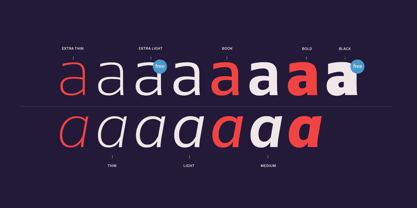
15
styles et des offres familiales.
En savoir plus sur cette famille
- Aa Glyphs
-
Meilleure offreOffres familiales
- Styles individuels
- Spécifications techniques
- Licences
À propos de la famille Cormac Police
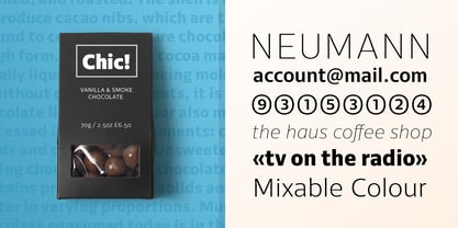
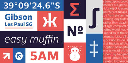
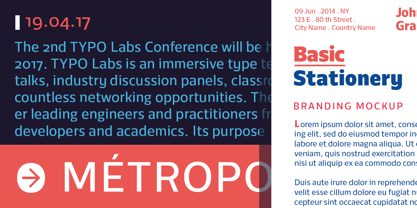
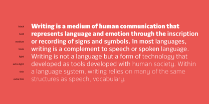
Cormac is a humanist typeface characterized with it's large x-height and slightly flared stems. The word that best describes our ideas in the beginning of the project is "simple" - the idea behind it was to strip the letter forms of everything unnecessary, and yet keep the typeface interesting.
The typeface is friendly without being too cheezy thanks to its humanistic character, flared ascenders and stems reminding of its calligraphic origin. The proportions are closer to the traditional old style typefaces. Cormac is open and readable typeface coming in 7 weights plus their matching 'true' italics - from Extra Thin to Bold.
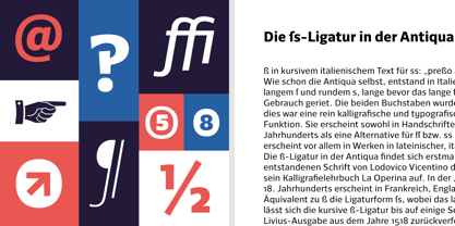
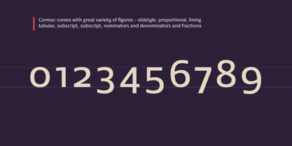
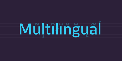
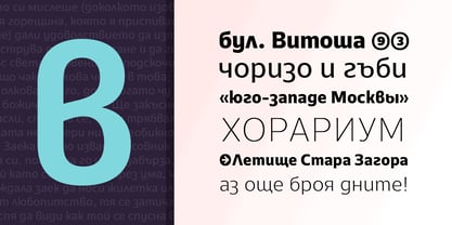
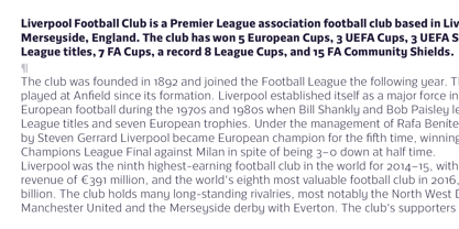
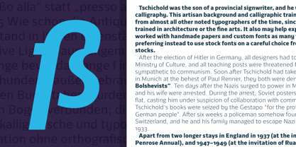
The family comes with Cyrillic support, great range of numerals, fractions, ligatures, alternates and a lot of special characters making Cormac a great solution for greate range of design work - branding, editorial, web, wayfinding, etc.
Concepteurs: Alexander Nedelev
Éditeur: Typedepot
Fonderie: Typedepot
Maître d'ouvrage: Typedepot
MyFonts débout: Jan 18, 2017
Cormac
À propos Typedepot
Typedepot co-founders Alexander Nedelev and Veronika Slavova say, “In the beginning, Typedepot was a side project, nothing serious – just experimenting with letterforms. Then, in a moment it just felt more right to do this than anything else.” Based in Sofia, Bulgaria, the duo first came upon type design while working as graphic designers in advertising. “We had absolutely no background in type design,” Alexander says, “but we had this project, a logotype for a small company, which we developed to become the Glide typeface.” Two years later they rented an office, took the plunge and started designing type full time. “Now it’s the thing we do and the thing we love to do.” So far they’ve seen great success with Best Seller Centrale Sans. The modern sans serif typeface was featured as one of MyFonts Most Popular Fonts of 2011 and was featured in our Rising Stars Newsletter that same year. The self-taught designers whose foundry started out as a way to experiment with type, say that their main focus is “to design original typefaces for retail and custom use.”
En savoir plus
Lire moins
- Le choix d'une sélection entraîne l'actualisation de la page entière.