DT PaperType has evolved and morphed over time from quite distant origins.
I previously created DT Paperside.
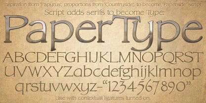
It was neither Papyrus nor SSI Countryside, but was inspired in some ways by the Papyrus form, although untextured and smoother, and had the more open dimensions and proportions, similar to that of Countryside SSi, with its larger easily readable lowercase body, and more consistent, shorter stems.
DT Paperside had an open scripted feel which was pleasing to the eye and easy to read.
DT PaperType has since been crafted from of the original Paperside font.
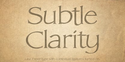
The Organic flow and comfortable form of Paperside has been retained, but it has been shifted very much from the feel of a script font, into a quality, extremely readable, organic and friendly, serif font, retaining its clarity, while adding a great deal of pose and class.
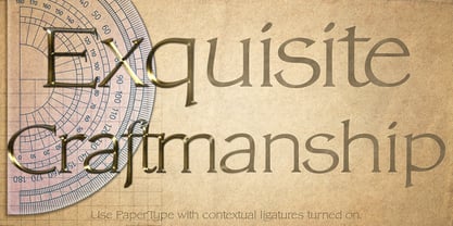
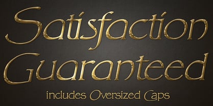
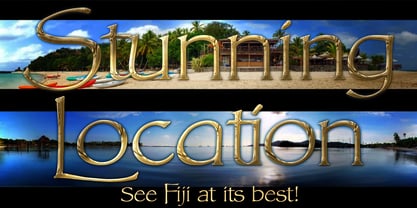
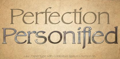
This font is primarily suited to body text, and as such is extremely readable. It does however also make an excellent Display font, and comes with a full set of over sized Caps that drop below the line to stand out on a headline when required.
Paperside can also automatically enhance the first letter of most sentences, and changes other letters to suit their position within words, and the letters they appear beside.
Now comes with an italic that curves and softens various letters.
For best results, use this ‘smart font’
with Contextual Ligatures turned on.
Mulitiple Stylistic Alternatives
are included.
Inspiration for this fonts predecessor (Paperside) came from two other fonts.
Papyrus: designed by Chris Costello and created in 1982, it is a hand-drawn textured typeface, emulating texts written in biblical times.
One of the most used (and misused) fonts of all times.
Owned by Letraset, and currently published by the Internation Typeface Corporating (ITC).
Countryside SSi: The serif font of an unknown designer, currently licensed by Southern Software Inc.
Feel free to preview some other Dragon Tongue fonts that are yet to be released, at https://www.dragon-tongue.com/fonts
À propos Dragon Tongue Foundry
Dragon Tongue Foundry. Scott Spensley from New Zealand, is the overall designer of all Dragon Tongue fonts. The foundry of Dragon Tongue came in to being around 40 years ago, to be a source of new music and graphic design ideas. The first real high quality digital font from this Foundry was created around 20 years ago. It was a digitised version of Scott’s wife’s calligraphy. It was stunningly good, and admired by all who saw it. It was never released. Sadly, after the his wife passed away from cancer, and multiple hard-drive crashes, the font was lost, and there are now no versions of it remaining. Dragon Tongue shut down for a period of time, but recently, with extra spare time created by Covid and lockdowns… the Foundry has re-awoken, and is focused totally on creating exciting new fonts, in multiple styles. Some of the current style directions are, Serif and San-Serif, Handwriting and script, hand drawn period, Art-Deco to 80’s, from serious high quality to funky and fun, extending the range of known font styles, and exploring modern adaptable fonts using contextual ligatures and Stylistic alternatives, swashes and ‘smart’ letters that adapt to their neighbours and position in a word or sentence. We aim to craft fonts that feel ‘clever’, as if it knows what the writer wants of it. Fonts that add a little bit more than a standard font does. In some cases, fonts that feel natural and alive. Feel free to check out some of his fonts that are yet to be released, at https://www.dragon-tongue.com/fonts
En savoir plus
Lire moins