


Sélectionnez ce type de licence lorsque vous développez une application pour iOS, Android ou Windows Phone et que vous intégrez le fichier de fonte dans le code de votre application mobile.
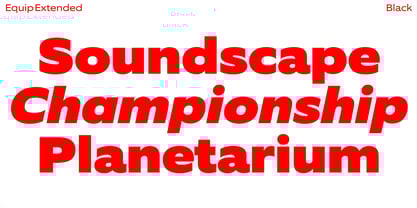
EquipExtended
par Hoftype
Styles individuels à partir de $0.00 USD
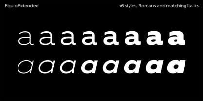
Famille complète de 16 polices: $198.00 USD


EquipExtended Font la famille était
conçu par
Dieter Hofrichter et
publié par
Hoftype. EquipExtended contient
16
styles et des offres familiales.
En savoir plus sur cette famille
- Aa Glyphs
-
Meilleure offreOffres familiales
- Styles individuels
- Spécifications techniques
- Licences
À propos de la famille EquipExtended Police
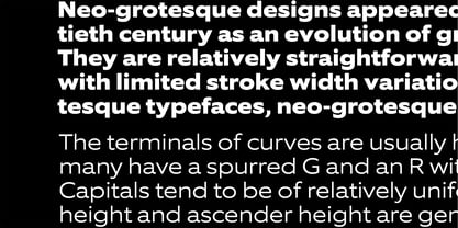
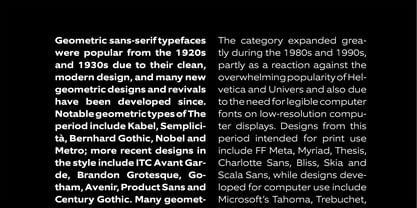
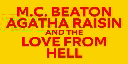
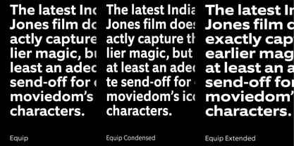
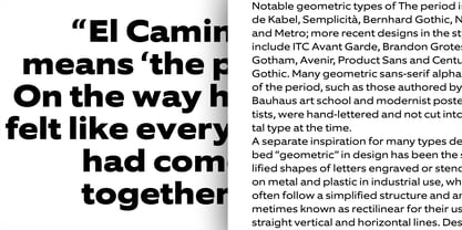
EquipExtended is the next complement for the Equip family and with its 16 fonts together with EquipCondensed, it extends the family to 48 styles. While developed from the same basic shape as the rest of the Equip family, it has its own particular friendly and warm appearance. With its wide and open proportions, EquipExtended makes a grand entrance for your headlines, subheads and even for the body of text. Try it out, the light style is free.
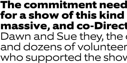
EquipExtended is very well suited for ambitious typography.
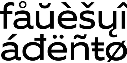
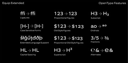
The EquipExtended family comes in OpenType format with extended language support. All weights contain semi-ligatures (design optimized single characters), proportional lining figures, tabular lining figures, proportional old style figures, lining old style figures, matching currency symbols, fraction- and scientific numerals and arrows.
Concepteurs: Dieter Hofrichter
Éditeur: Hoftype
Fonderie: Hoftype
Maître d'ouvrage: Hoftype
MyFonts débout: Nov 4, 2013
EquipExtended
À propos Hoftype
German designer Dieter Hofrichter started his foundry in 2010. Since then, he has remained focused on developing text fonts that integrate the rich history and tradition of typography with contemporary styles. Based in Munich, his first typeface on MyFonts was Impara, a sans serif with lively stroke ductus and distinct humanistic characteristics that is a representation of linear coolness and classic elegance. Since his debut, he has continued to produce beautiful, high quality serif faces. Capita, one of the foundry’s best sellers, is a self-dominated face with a fresh style that avoids the harshness of many slab serifs. Dieter has also seen success with one of his most recent designs, Mangan, a text face that combines classical rationality with contemporary design. “One of our intentions is to utilize the knowledge of the history of type to create contemporary types,” Dieter says. “Style consciousness and many years of experience in type design are our qualifications for producing functional and usable types of high quality.”
En savoir plus
Lire moins
- Le choix d'une sélection entraîne l'actualisation de la page entière.