


Sélectionnez ce type de licence lorsque vous développez une application pour iOS, Android ou Windows Phone et que vous intégrez le fichier de fonte dans le code de votre application mobile.
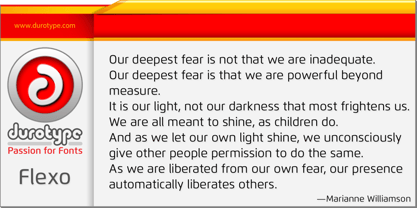
Flexo™
par Durotype
Styles individuels à partir de $0.00 USD
Famille complète de 17 polices: $279.00 USD


Flexo Font la famille était
conçu par
Ben Blom et
publié par
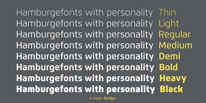
Durotype. Flexo contient
17
styles et des offres familiales.
En savoir plus sur cette famille
- Aa Glyphs
-
Meilleure offreOffres familiales
- Styles individuels
- Spécifications techniques
- Licences
À propos de la famille Flexo Police
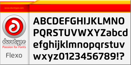
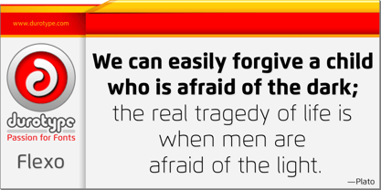
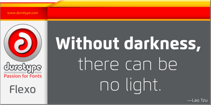
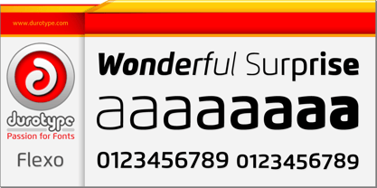
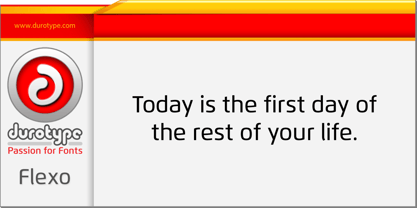
Flexo is a geometric sans typeface, with humanistic warmth. It is a synthesis of the geometric and the humanistic. It has both mathematical straightforwardness, and humanistic refinement.
Flexo has a squarish design, making it stand out in many uses. It will shine in both headlines and text. It is well suited for graphic design and corporate identity design. Flexo has sixteen styles, extensive language support, eight different kinds of figures, sophisticated OpenType features — so it’s ready for advanced typographic projects.
Free demo font available.
Flexo in use: 1 2 3 4 5 6 7 8 9 10 11 12 13.
For more information about Flexo, download the PDF Specimen Manual.
Concepteurs: Ben Blom
Éditeur: Durotype
Fonderie: Durotype
Maître d'ouvrage: Durotype
MyFonts débout: Feb 25, 2012
Flexo™
is a trademark of Durotype.
À propos Durotype
Durotype is an innovative font foundry based in Best, The Netherlands. It has been founded by Ben Blom in 2010. All Durotype fonts are created out of passion for the design involved. They are crafted in a long process of creation and improvement, until the right fusion of the functional and esthetical has been achieved. With whatever passion they are created—Durotype fonts are, in the end, just high-quality tools with a bit of pizzazz. Most of them are rather universal tools: their design doesn’t determine any specific uses. Many of them are very versatile: they have many styles and many glyphs. Many of them are, given their design, crafted in a way to maximize their legibility. Durotype fonts are meant to be durable: in many years from now, they should be just as enjoyable and useful as they are today. Durotype fonts have been deployed successfully in many areas. In financial services, entertainment, and museums. In television, marketing, and corporate identities. In technology, sports, automotive, and real estate. In food, retail, B2B, and health. In e-books, apps, ATMs, and video phones. In web sites, catalogs, signage, and packaging. Et cetera. Durotype’s most successful fonts are Flexo, a squarish design (MyFonts Most Popular Fonts of 2012), and Aspira, a legible geometric family with a very big number of styles. Flexo in use: 1 2 3 4 5 6 7 8 9 10 11 12 13. Aspira in use: 1 2 3 4 5 6 7 8 9 10.
En savoir plus
Lire moins
- Le choix d'une sélection entraîne l'actualisation de la page entière.