


Sélectionnez ce type de licence lorsque vous développez une application pour iOS, Android ou Windows Phone et que vous intégrez le fichier de fonte dans le code de votre application mobile.
Futura® PT
par ParaType
Styles individuels à partir de $39.00 USD
30% Off
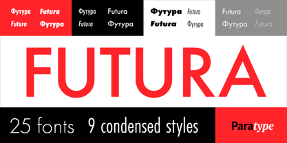
Famille complète de 25 polices: $399.00 USD

Futura PT Font la famille était
conçu par
Vladimir Yefimov,
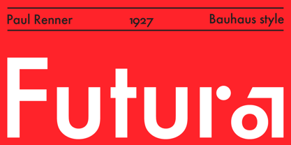
Paul Renner,
Isabella Chaeva et
publié par
ParaType. Futura PT contient
25
styles et des offres familiales.
En savoir plus sur cette famille
- Aa Glyphs
-
Meilleure offreOffres familiales
- Styles individuels
- Spécifications techniques
- Licences
Basic typesetting
Letter case
Numerals and scientific typesetting
Typographic variants
Réinitialiser
Par style :
$15.96 USD
$11.17 USD
Paquet de 25 styles:
$399.00 USD
$279.30 USD
Futura PT Normal Set
16 policesPar style :
$21.18 USD
$14.83 USD
Paquet de 16 styles:
$339.00 USD
$237.30 USD
Futura PT Condensed Set
9 policesPar style :
$22.11 USD
$15.48 USD
Paquet de 9 styles:
$199.00 USD
$139.30 USD
À propos de la famille Futura PT Police
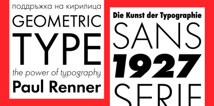
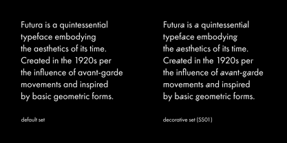
Futura is a quintessential typeface embodying the aesthetics of its time. Created in the 1920s per the influence of avant-garde movements (e.g., Bauhaus) and inspired by basic geometric forms, it reflects the then-modern view of purity in both form and functionality. While Paul Renner had envisioned it as the “typeface of the future”, initial designs proved difficult to read due to overly simplified letter shapes. The first commercially successful Futura revision released in 1927, however, became popular quite quickly.
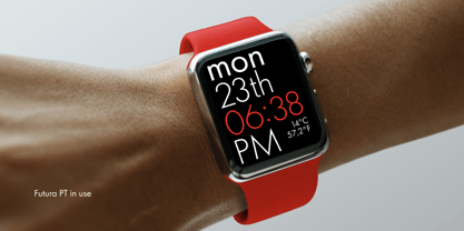
Futura’s aesthetic features include the lack of contrast in lighter weights, strict geometric forms, and minimalism intended for clarity. Despite its constructivist rigor, the typeface echoes the Roman capital style that has remained relevant to this day. Futura continues to be valued in its digital form for its simplicity and refined shapes.
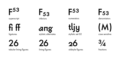
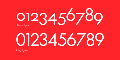
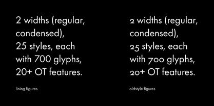
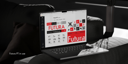
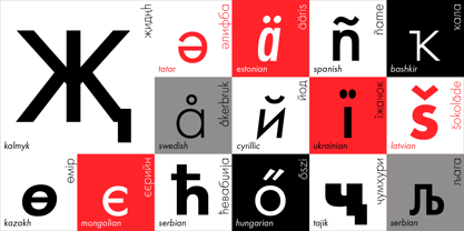
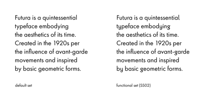
One of the most comprehensive Futura typefaces on the market, Future PT comprises 25 styles across two widths—Regular and Condensed—each consisting of over 770 glyphs and including 20+ OpenType features (e.g., old-style figures and stylistic alternates). It also supports over 150 languages, including extended Latin and Cyrillic alphabets, with three stylistic sets that make it an exceptionally versatile type system and dramatically influence its character: a traditional basic set (familiar to most), neutral-functional set, and display set.
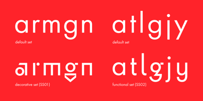
The neutral-functional set features more “standard” lowercase shapes for letters such as t, j, l, and y, with tails: with shapes softening the typeface’s original tone, adding a sense of neutrality and fostering easier integration into a wide range of design contexts. The display set, meanwhile, draws inspiration from Paul Renner’s earliest sketches to give Futura PT a bolder, more memorable look with almost-exaggerated geometry. We recommend everyone try out Futura in this form to experience the typeface as Renner first envisioned it.
Primary font characteristics are as follows:
- 2 widths: Regular, Condensed
- 25 styles, each with 770 glyphs
- 20+ OpenType features, including stylistic alternates and oldstyle figures
- Extended Latin and Cyrillic support
If you need font files in different formats or would like to try out this font, just reach out to us at info@paratype.net, and we’ll be happy to assist.
After Vladimir Yefimov designed the initial version of Futura PT between 1991–1995, it was revised in 2007 and significantly expanded/updated in 2022. In October 2024, Paratype updated Futura PT to Version 3.000.
Futura is a registered trademark of Bauer Types, SL
Concepteurs: Vladimir Yefimov, Paul Renner, Isabella Chaeva
Éditeur: ParaType
Fonderie: ParaType
Fonderie d'origine: Bauersche Giesserei
Maître d'ouvrage: ParaType
MyFonts débout: Dec 8, 2003
Futura® PT
is a registered Trademark of Bauer Types.

À propos ParaType
Paratype has been designing, developing and distributing digital fonts since the 1980’s. Our ever-growing library of hundreds of typefaces includes some of the most widely used fonts, such as Futura PT, DIN 2014, Circe, Vast, Fact and PT Sans/Serif Pro. Paratype fonts have extensive language support covering Latin, Cyrillic and Greek scripts. We also create...
En savoir plus