


Sélectionnez ce type de licence lorsque vous développez une application pour iOS, Android ou Windows Phone et que vous intégrez le fichier de fonte dans le code de votre application mobile.
Galano Classic
par René Bieder
Styles individuels à partir de $0.00 USD
Famille complète de 40 polices: $200.00 USD


Galano Classic Font la famille était
conçu par
René Bieder et
publié par
René Bieder. Galano Classic contient
44
styles et des offres familiales.
En savoir plus sur cette famille
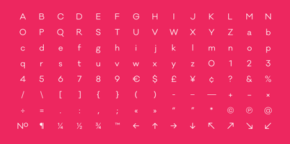
- Aa Glyphs
-
Meilleure offreOffres familiales
- Styles individuels
- Spécifications techniques
- Licences
Galano Classic Family
20 policesPar style :
$9.50 USD
Paquet de 20 styles:
$190.00 USD
Galano Classic Alt Family
20 policesPar style :
$9.50 USD
Paquet de 20 styles:
$190.00 USD
Galano Classic Uprights Starterpack
10 policesPar style :
$15.00 USD
Paquet de 10 styles:
$150.00 USD
Galano Classic Italics
10 policesPar style :
$15.00 USD
Paquet de 10 styles:
$150.00 USD
Galano Classic Alt Uprights Starterpack
10 policesPar style :
$15.00 USD
Paquet de 10 styles:
$150.00 USD
Galano Classic Alt Italics
10 policesPar style :
$15.00 USD
Paquet de 10 styles:
$150.00 USD
Galano Classic Uprights Starterpack
5 policesPar style :
$20.00 USD
Paquet de 5 styles:
$100.00 USD
Galano Classic Italics Starterpack
5 policesPar style :
$20.00 USD
Paquet de 5 styles:
$100.00 USD
Galano Classic Alt Uprights Starterpack
5 policesPar style :
$20.00 USD
Paquet de 5 styles:
$100.00 USD
Galano Classic Alt Italics Starterpack
5 policesPar style :
$20.00 USD
Paquet de 5 styles:
$100.00 USD
À propos de la famille Galano Classic Police
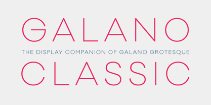
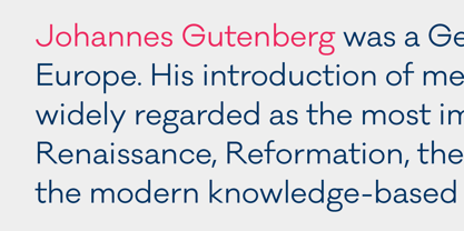
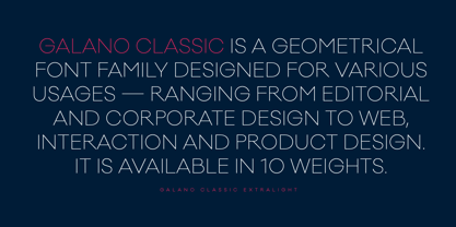
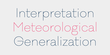
Galano Classic is the display companion of the Galano Grotesque family.
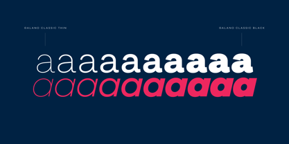
Like the Grotesque family, it also pays tribute to the geometric shapes of Futura, Avant Garde, Avenir and the like. However, instead of that family’s modern interpretation of the geometric genre, Galano Classic prefers to stay in the past, a tendency characterized by a moderate x-height and details like the long stretched leg of uppercase “R”, as well as the traditional shaped lowercase “g”, to mention only a few details.
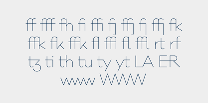
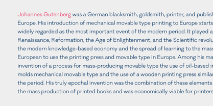
Galano Classic, compared to Galano Grotesque, includes lots of redesigned glyphs and consequently adjusted kerning pairs, an extended number of alternative characters, ligatures and opentype features to match a great many design applications. It comes in 10 different weights with matching italics containing 555 glpyhs per font. Although Galano Classic was planned to be the display version of Galano Grotesque, it feels great in small sizes and long text passages, too.
Concepteurs: René Bieder
Éditeur: René Bieder
Fonderie: René Bieder
Maître d'ouvrage: René Bieder
MyFonts débout: Dec 31, 2014
Galano Classic

À propos René Bieder
René Bieder (*1982) is a trained Graphic designer and Art Director and self taught type designer. Before setting up his own studio as a type designer in 2013, he was employed in various small and large advertising agencies as an Art Director and Graphic Designer working for national and international clients. During his agency time he developed a deep interest in type design and started designing typefaces as a side project. His second commercial release has won the title "Myfonts Most popular typeface of the year 2012". Since then his typefaces were a constant on the Myfonts best seller lists. Today, you can find his work all around the world. From the Nemo Science Museum in Amsterdam to the University of Florida.The Premium foundry page can be viewed Here.
En savoir plus
Lire moins
- Le choix d'une sélection entraîne l'actualisation de la page entière.