


Sélectionnez ce type de licence lorsque vous développez une application pour iOS, Android ou Windows Phone et que vous intégrez le fichier de fonte dans le code de votre application mobile.
Heller Sans JNL
par Jeff Levine
Styles individuels à partir de $29.00 USD
Famille complète de 2 polices: $55.10 USD


Heller Sans JNL Font la famille était
conçu par
Jeff Levine et
publié par
Jeff Levine. Heller Sans JNL contient
2
styles et des offres familiales.
En savoir plus sur cette famille
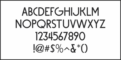
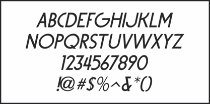
- Aa Glyphs
-
Meilleure offreOffres familiales
- Styles individuels
- Spécifications techniques
- Licences
Par style :
$27.55 USD
Paquet de 2 styles:
$55.10 USD
À propos de la famille Heller Sans JNL Police
Heller Sans JNL is based on the main letterforms of an experimental alphabet designed by Steven Heller; noted author of over 170 books on design and visual culture. Some modifications were made in turning his design into a digital font.
In his own words, here is the background to this typeface:
“I recently recovered this from the junk heap. It is a yellowing photostat of my first and only typeface design (1969-70). Total folly! At the time I was smitten by Art Moderne lettering. I called it “Klaus Boobala Bold” because I liked the K and B.
I’ve lost the letters S through Z, which were made. The letters were drawn with compass, Techno pen (that frequently clogged). as well as a triangle and T-square. The inline and outline made no real logical sense.
I based the design, in part, on Kabel, Avant Garde and it was a product of whatever I could accomplish with those tools. The caps-only alphabet was photographed and produced as a film negative that was cut in foot-long strips and spliced to fit on a Typositor reel. Sadly, the negatives made for the font were too brittle and the splice snapped apart in the Typositor.
I worked on it for well over a month and used the face only once. I realized with this attempt, like so many other times I attempted different challenges, that type design — indeed mechanical drawing — was not my strong suit.”
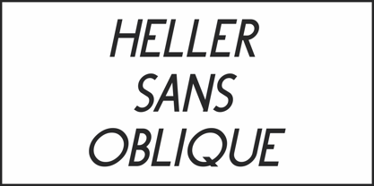
Heller Sans JNL is available in both regular and oblique versions.
Concepteurs: Jeff Levine
Éditeur: Jeff Levine
Fonderie: Jeff Levine
Maître d'ouvrage: Jeff Levine
MyFonts débout: Dec 18, 2019
Heller Sans JNL
À propos Jeff Levine
Jeff Levine has been in love with lettering since the third grade, when a schoolmate brought a lettering stencil into class. He has worked in both the graphics and music industries, and began his work with digital type via his own site, which hosted over one hundred free dingbat fonts until its retirement in 2009. Although these fonts were experimental at best, Jeff received "thank you" letters from points all over the world for making his designs available. Encouraged by these responses, Jeff decided to set his sights on creating interesting and commercially viable type fonts.
En savoir plus
Lire moins
- Le choix d'une sélection entraîne l'actualisation de la page entière.