


Sélectionnez ce type de licence lorsque vous développez une application pour iOS, Android ou Windows Phone et que vous intégrez le fichier de fonte dans le code de votre application mobile.
Imagist
par Fenotype
Styles individuels à partir de $0.00 USD
Famille complète de 12 polices: $99.00 USD


Imagist Font la famille était
conçu par
Emil Karl Bertell,
Erik Jarl Bertell,
Teo Tuominen et
publié par
Fenotype. Imagist contient
12
styles et des offres familiales.
En savoir plus sur cette famille
- Aa Glyphs
-
Meilleure offreOffres familiales
- Styles individuels
- Spécifications techniques
- Licences
Upright Family
6 policesPar style :
$11.50 USD
Paquet de 6 styles:
$69.00 USD
Italic Family
6 policesPar style :
$11.50 USD
Paquet de 6 styles:
$69.00 USD
Beginner Package
6 policesPar style :
$11.50 USD
Paquet de 6 styles:
$69.00 USD
À propos de la famille Imagist Police
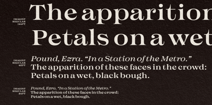
The mystic sadness of the sight
Of a far town seen in the night.
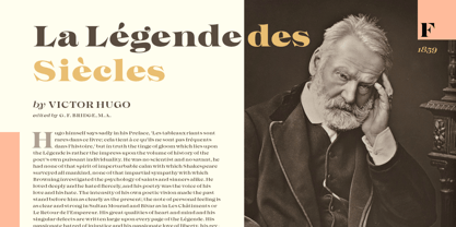
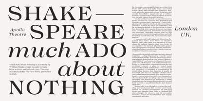
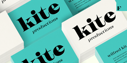
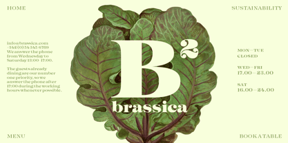
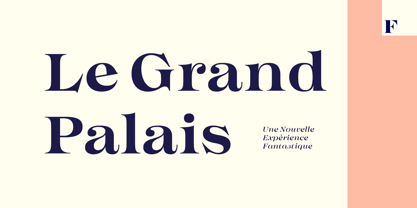
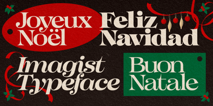
Like the poetry movement of the early 20th century, from which the font takes its name, Imagist relies on the power of concrete images and brings an organic vibration to the words it forms. Imagist is a lively and decorative serif typeface with prominent features that appear especially in the letters K, R, M, N, W, V, k, w, v and y. Powerful ball terminals also bring recognizable attraction.
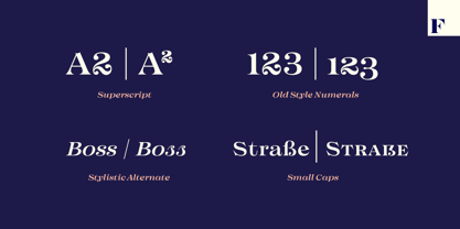
Imagist contains six weights and corresponding Italics. Italics have a cursive-style letter s for as Stylistic Alternate. Old Style Numerals and Small Caps can be found in all cuts.
Poem by T. E. Hulme.
Concepteurs: Emil Karl Bertell, Erik Jarl Bertell, Teo Tuominen
Éditeur: Fenotype
Fonderie: Fenotype
Maître d'ouvrage: Fenotype
MyFonts débout: Nov 26, 2021
Imagist
À propos Fenotype
Emil Bertell has done it all. Having published his first font files at 16, he was considered to be an international free-font hero while still in his teens. He went on to attend design college, drop out, and become a well-known graphic designer and illustrator. Now one of the most successful type designers from the Nordic countries on MyFonts, the Finland-based designer said in his Creative Characters interview that he’s “had an obsession with visual culture from the beginning.” Before turning his attention to type design full-time, Emil had a very successful career as an award-winning illustrator. “Illustration became my main livelihood,” he said. “I drew painstaking pencil illustrations for magazines, advertising, stamps, etc. I often designed my own fonts for festivals and hand-drew the lettering posters; I also did a few pencil illustrations based on lettershapes, and that got out of hand, so I had to do a lot more of them.” In 2012 he finally made the switch and committed all of his time to type design. Emil first saw success with his Billboard typeface. “It became my first Rising Star on MyFonts and made me realize that I could actually make a living by designing fonts,” he said. “I realized that there’s actually a market out there that I could become a part of.” Throughout the rest of that year he began to see even more success. It began in January, when his font, Mishka, was featured in our Most Popular Fonts of 2011 list. He went on to find a way to bookend the year and was listed among the Most Popular Fonts of 2012 with his Mercury Script design. Since then, his foundry’s success has continued on with best sellers like Voyage and The Carpenter. Fans of the foundry have a lot to look forward to in the near future. Emil will continue to produce beautiful scripts (some coming soon to MyFonts!) and has plans to expand his business.
En savoir plus
Lire moins
- Le choix d'une sélection entraîne l'actualisation de la page entière.