


Sélectionnez ce type de licence lorsque vous développez une application pour iOS, Android ou Windows Phone et que vous intégrez le fichier de fonte dans le code de votre application mobile.
Journal Sans New
par ParaType
Styles individuels à partir de $40.00 USD
Famille complète de 6 polices: $180.00 USD

Journal Sans New Font la famille était
conçu par
Alexandra Korolkova,
Marya Kharlamova (Selezeneva),
Maria Selezeneva et
publié par
ParaType. Journal Sans New contient
6
styles et des offres familiales.
En savoir plus sur cette famille
- Aa Glyphs
-
Meilleure offreOffres familiales
- Styles individuels
- Spécifications techniques
- Licences
Basic typesetting
Letter case
Numerals and scientific typesetting
Typographic variants
Réinitialiser
Par style :
$30.00 USD
Paquet de 6 styles:
$180.00 USD
À propos de la famille Journal Sans New Police
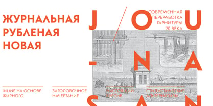
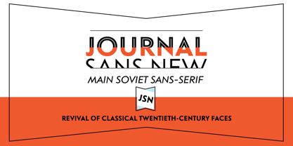
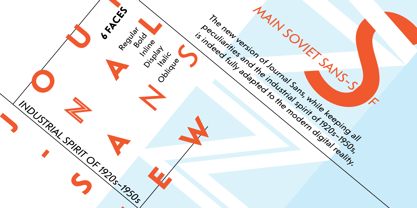
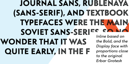
The Journal Sans typeface was developed in the Type Design Department of SPA of Printing Machinery in Moscow in 1940–1956 by the group of designers under Anatoly Schukin. It was based on Erbar Grotesk by Jacob Erbar and Metro Sans by William A. Dwiggins, the geometric sans-serifs of the 1920s with the pronounced industrial spirit. Journal Sans, Rublenaya (Sans-Serif), and Textbook typefaces were the main Soviet sans-serifs. So no wonder that it was digitized quite early, in the first half of 1990s. Until recently, Journal Sans consisted of three faces and retained all the problems of early digitization, such as inaccurate curves or side-bearings copied straight from metal-type version.
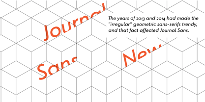
The years of 2013 and 2014 made «irregular» geometric sans-serifs trendy, and that fact affected Journal Sans. In the old version curves were corrected and the character set was expanded by Olexa Volochay. In the new release, besides minor improvements, a substantial work has been carried out to make the old typeface work better in digital typography and contemporary design practice.
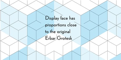
Maria Selezeneva significantly worked over the design of some glyphs, expanded the character set, added some alternatives, completely changed the side-bearings and kerning. Also, the Journal Sans New has several new faces, such as true italic (the older font had slanted version for the italic), an Inline face based on the Bold, and the Display face with proportions close to the original Erbar Grotesk.
The new version of Journal Sans, while keeping all peculiarities and the industrial spirit of 1920s-1950s, is indeed fully adapted to the modern digital reality. It can be useful either for bringing historical spirit into design or for modern and trendy typography, both in print and on screen.
Designed by Maria Selezeneva with the participation of Alexandra Korolkova. Released by ParaType in 2014.
Concepteurs: Alexandra Korolkova, Marya Kharlamova (Selezeneva), Maria Selezeneva
Éditeur: ParaType
Fonderie: ParaType
Maître d'ouvrage: ParaType
MyFonts débout: Apr 22, 2014
Journal Sans New

À propos ParaType
Paratype has been designing, developing and distributing digital fonts since the 1980’s. Our ever-growing library of hundreds of typefaces includes some of the most widely used fonts, such as Futura PT, DIN 2014, Circe, Vast, Fact and PT Sans/Serif Pro. Paratype fonts have extensive language support covering Latin, Cyrillic and Greek scripts. We also create...
En savoir plus