


Sélectionnez ce type de licence lorsque vous développez une application pour iOS, Android ou Windows Phone et que vous intégrez le fichier de fonte dans le code de votre application mobile.
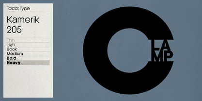
Kamerik 205
par Talbot Type
Styles individuels à partir de $19.50 USD
Famille complète de 12 polices: $99.00 USD


Kamerik 205 Font la famille était
conçu par
Adrian Talbot et
publié par
Talbot Type. Kamerik 205 contient
12
styles et des offres familiales.
En savoir plus sur cette famille
- Aa Glyphs
-
Meilleure offreOffres familiales
- Styles individuels
- Spécifications techniques
- Licences
Kamerik 205 Medium & Medium Oblique
2 policesPar style :
$13.00 USD
Paquet de 2 styles:
$26.00 USD
Kamerik 205 Light & Light Oblique
2 policesPar style :
$13.00 USD
Paquet de 2 styles:
$26.00 USD
Kamerik 205 Heavy & Heavy Oblique
2 policesPar style :
$13.00 USD
Paquet de 2 styles:
$26.00 USD
Kamerik 205 Book & Book Oblique
2 policesPar style :
$13.00 USD
Paquet de 2 styles:
$26.00 USD
Kamerik 205 Bold & Bold Oblique
2 policesPar style :
$13.00 USD
Paquet de 2 styles:
$26.00 USD
À propos de la famille Kamerik 205 Police
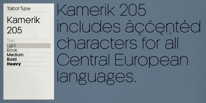
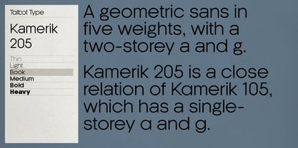
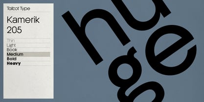
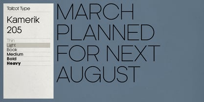
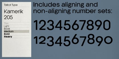
Kamerik 205 is inspired by the classic, geometric sans-serifs such as Futura and Avant Garde, but has shallower ascenders and descenders for a more compact look, and features a traditional double-storey lower case a and g. It's a versatile, modern sans, highly legible as a text font and with a clean, elegant look as a display font at larger sizes. It includes old style non-aligning (lower case) numbers, both proportional and tabular as well as accented characters for Central European languages. The Kamerik 205 family comprises of six weights, and is closely related to Kamerik 105. The most notable differences between the two variations, are the two-storey lower case a and g in Kamerik 205, where they are single-storey in Kamerik 105.
Concepteurs: Adrian Talbot
Éditeur: Talbot Type
Fonderie: Talbot Type
Maître d'ouvrage: Talbot Type
MyFonts débout: May 30, 2012
Kamerik 205

À propos Talbot Type
Most of my fonts are influenced by the classic movements of the twentieth century — Modernism, the Bauhaus, Constructivism and Art Deco — I aspire to create timeless designs, valid now and in the future. These are not showy faces, but practical, hard-working text and display fonts. Occasionally I branch out into more experimental, display fonts, possibly as a result of my years as a graphic designer with a focus on identities and communications and the need to stand out from the crowd — in a good way.
En savoir plus
Lire moins
- Le choix d'une sélection entraîne l'actualisation de la page entière.